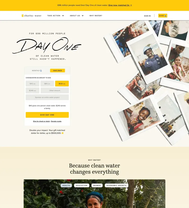
charity: water
Nonprofit that made donation pages feel like premium product pages.
428 hand-picked sites across 36 categories
A hand-picked collection of landing pages, portfolios, and SaaS websites. Browse by category, refine with the filters, or search below.
Nonprofit that made donation pages feel like premium product pages.
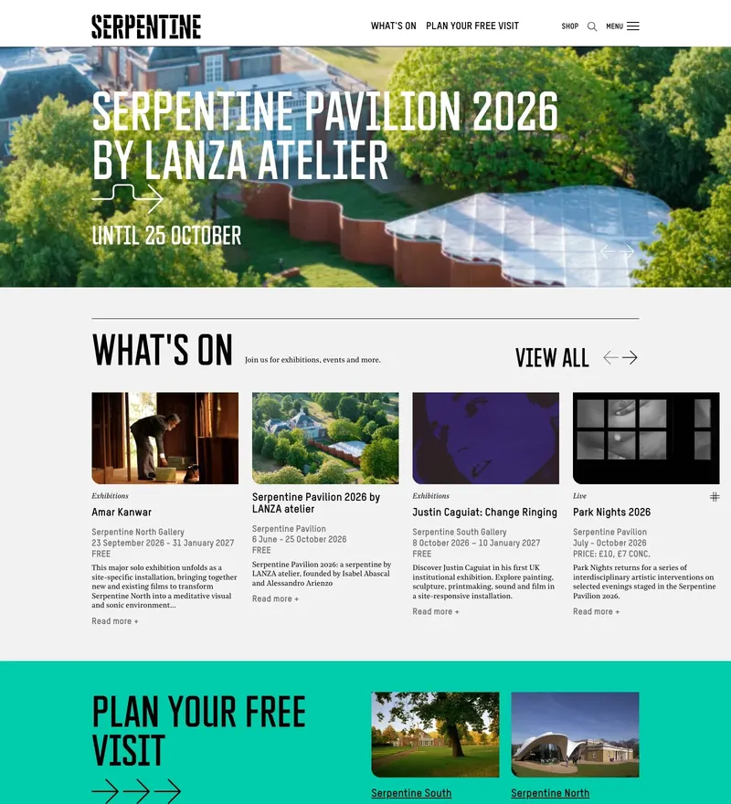
London contemporary art institution with a boldly typographic identity.
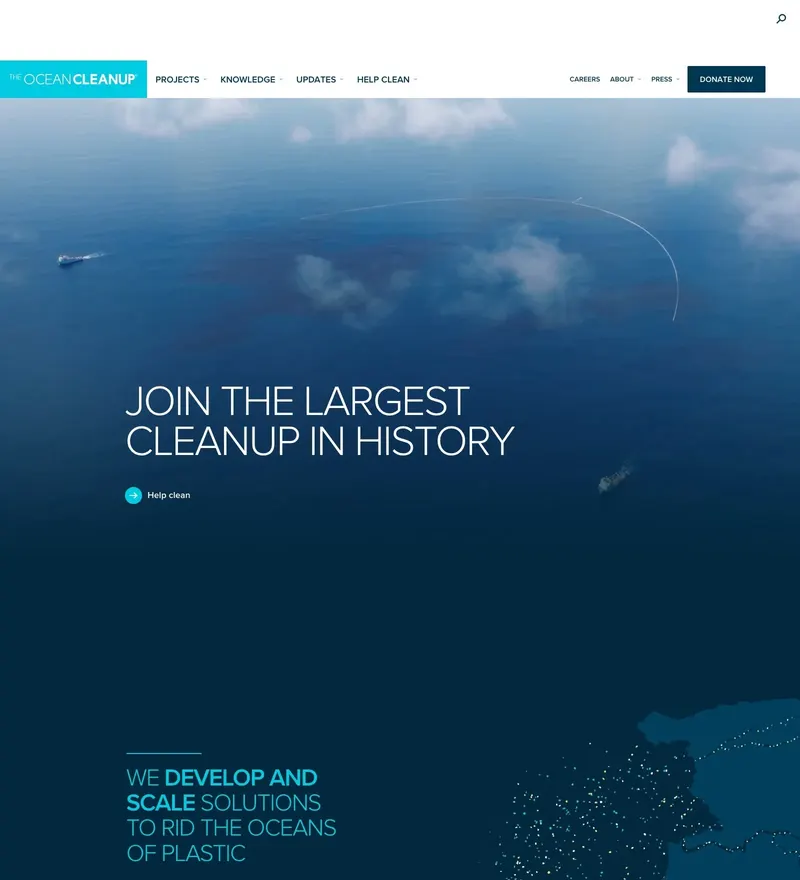
Engineering nonprofit that explains a hard problem through scrollytelling.
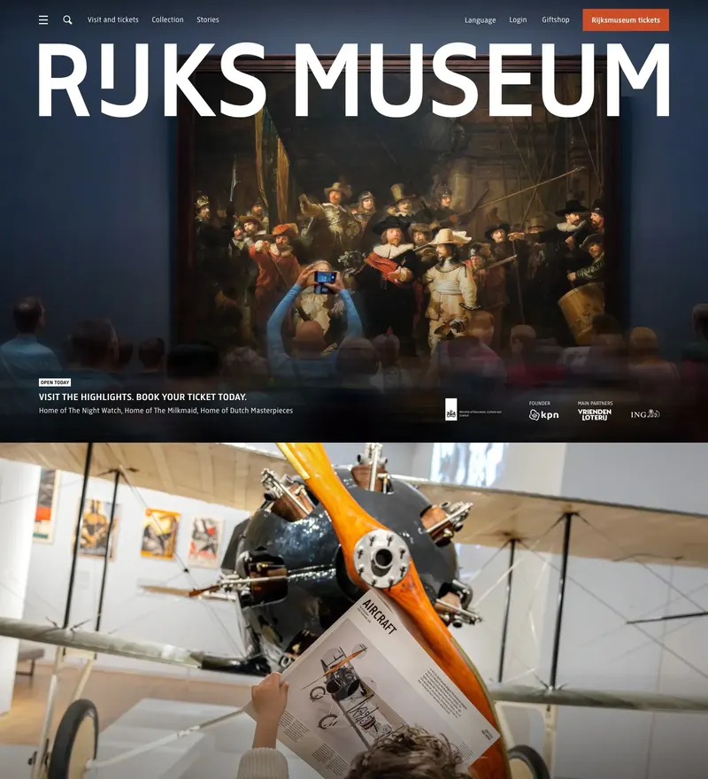
Dutch national museum with one of the best digital collections online.
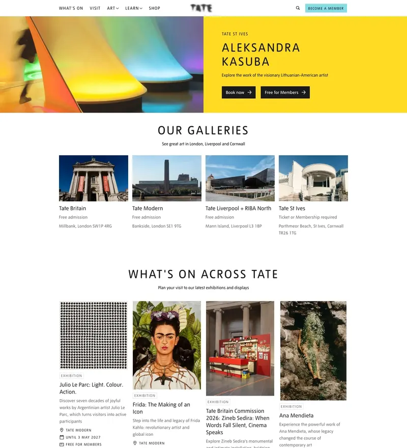
Four galleries and a vast collection, organised without visual noise.
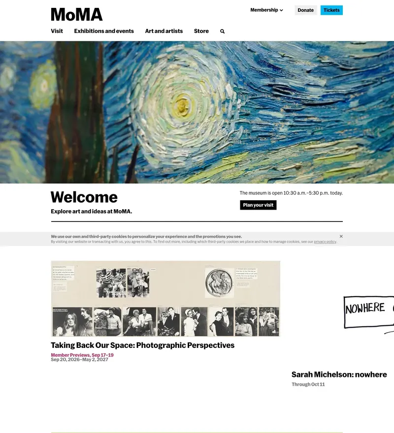
The Museum of Modern Art, with a collection interface that respects the work.
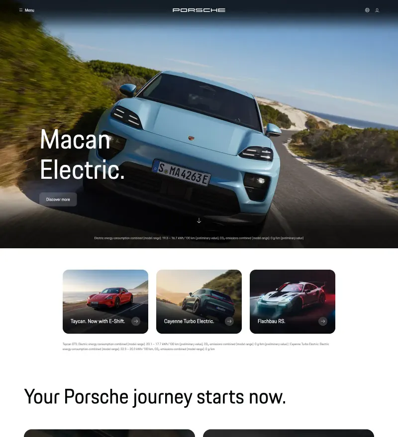
Configurator-driven site for a brand with sixty years of visual equity.
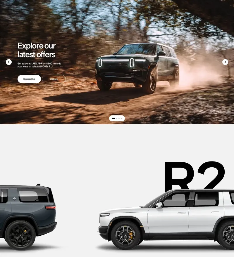
Electric adventure vehicles sold through landscape photography.
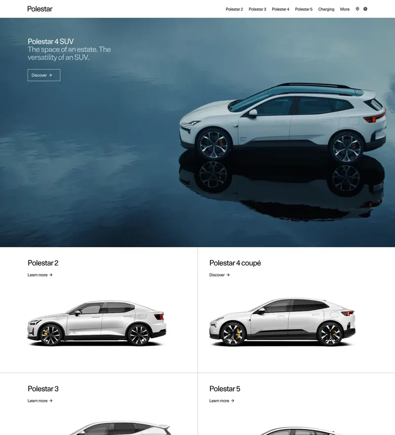
Electric performance brand with Scandinavian minimalism taken to the limit.
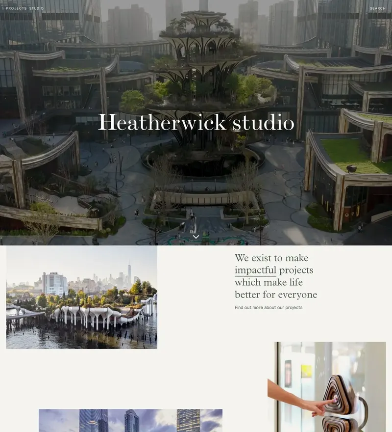
Design and architecture studio with a project archive built for browsing.
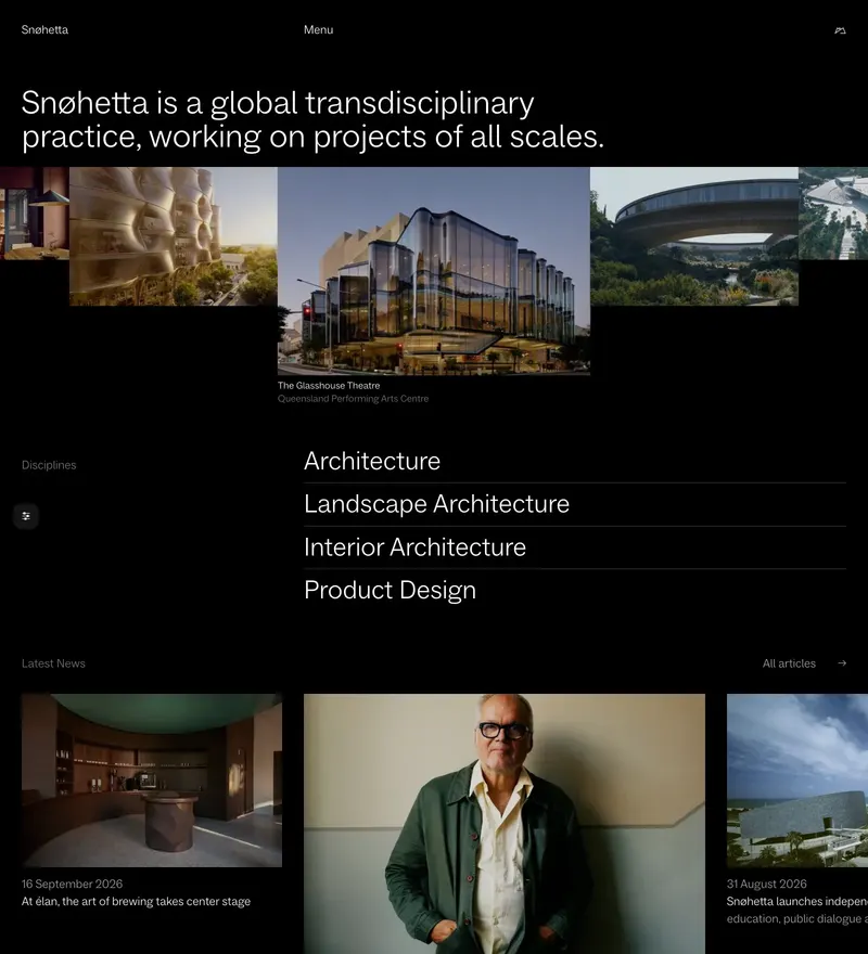
Norwegian architecture and design practice with a photography-led portfolio.
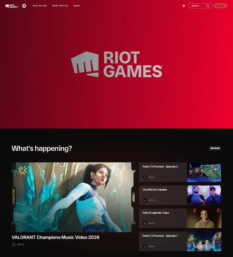
Game studio site built to carry several enormous franchises at once.
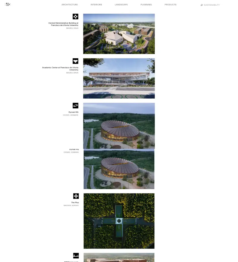
Bjarke Ingels Group — an architecture practice indexed like a database.
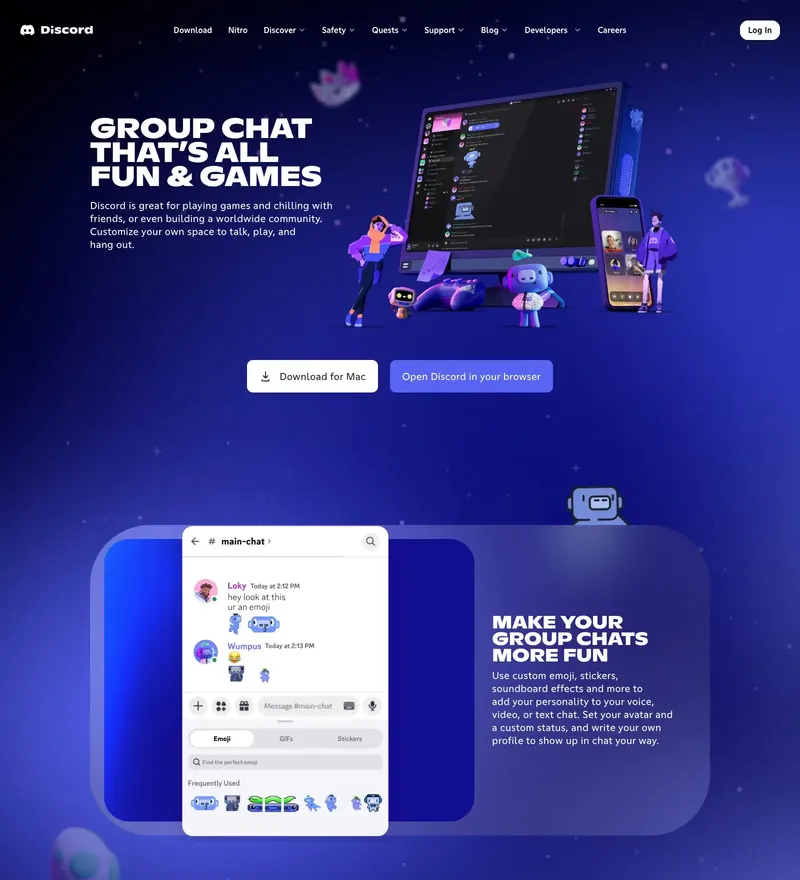
Community chat platform with an illustration system that never takes itself seriously.
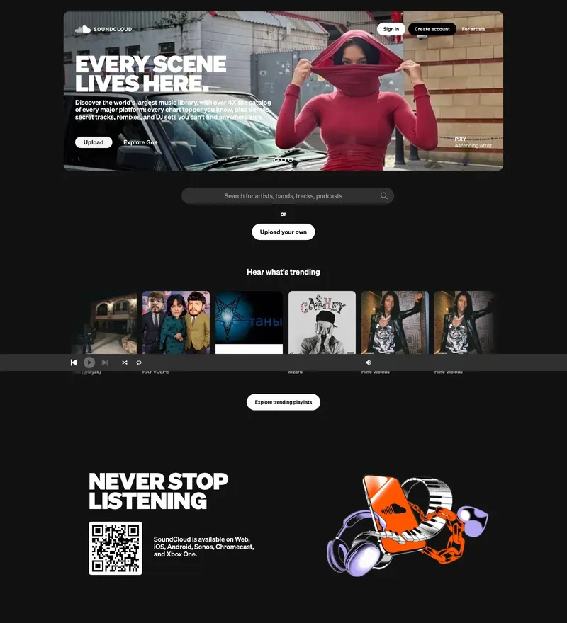
Audio platform built around the waveform.
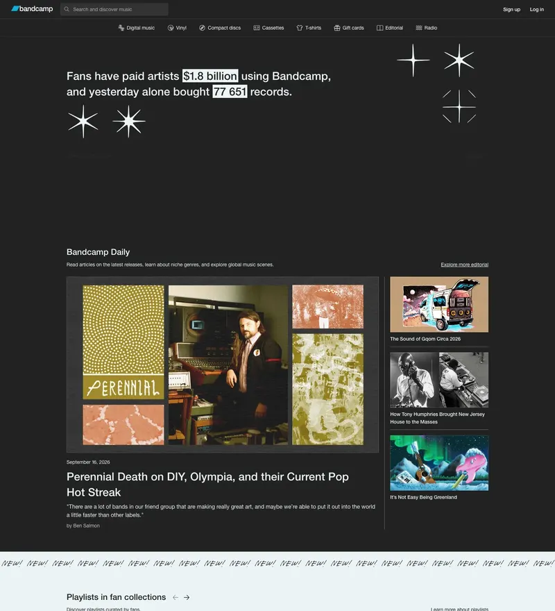
Artist-first music marketplace that has kept its dense, functional layout for years.
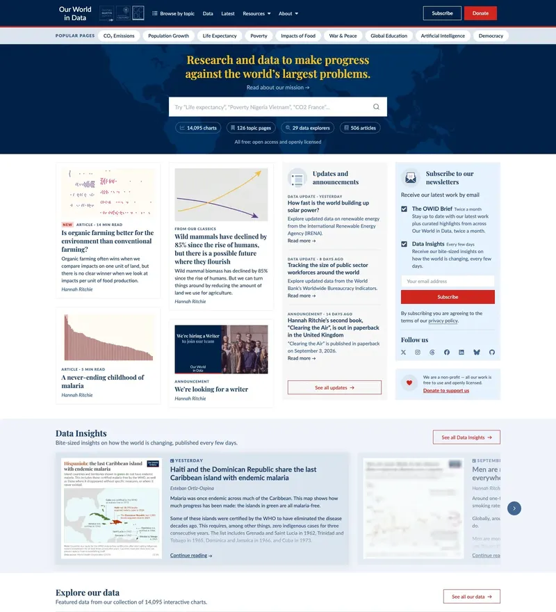
Research and data on the world's biggest problems — charts as the interface.
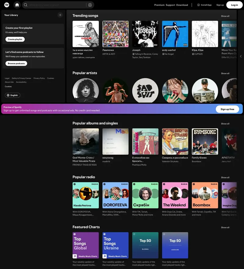
Streaming giant with a duotone system that scales to every campaign.
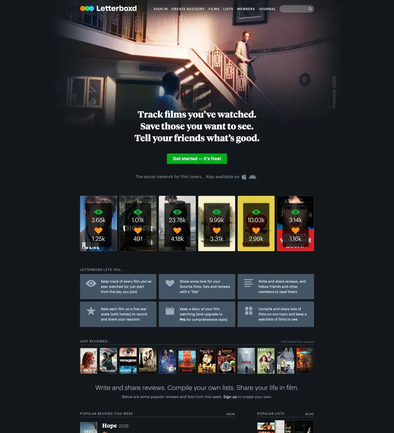
Social network for film lovers, built on posters and lists.
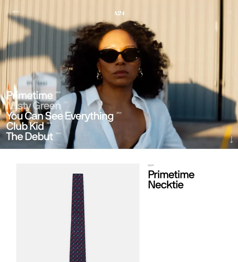
Film studio with a store and a site that feel like part of the catalogue.
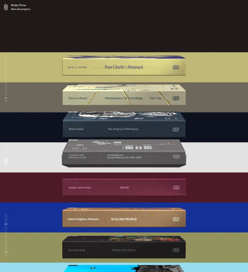
Books about technological progress, with covers rendered in 3D on the shelf.
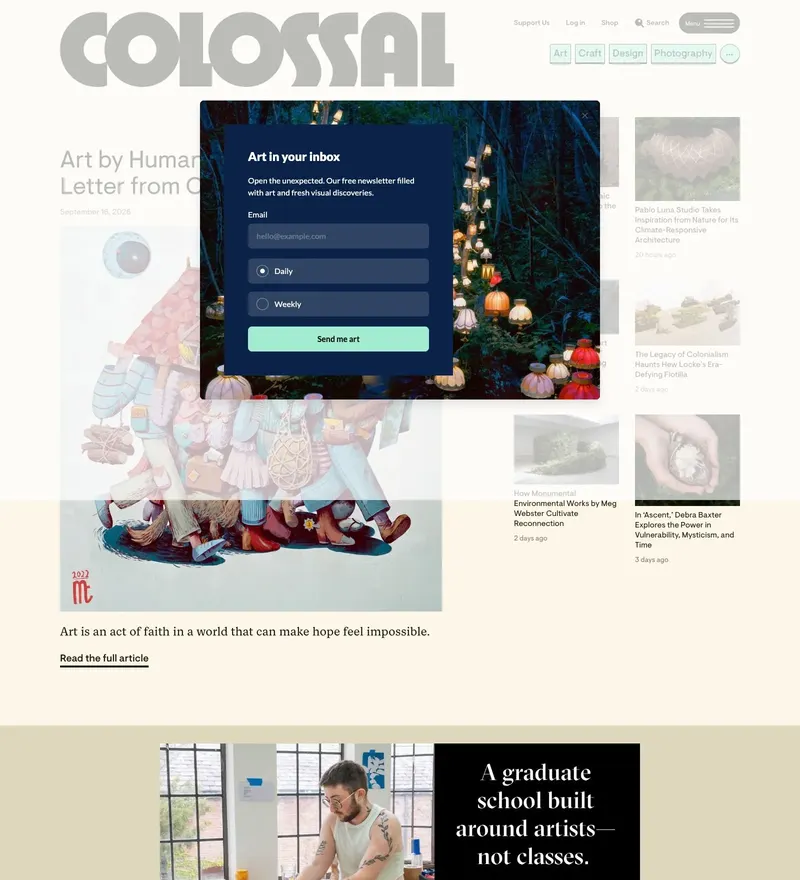
Contemporary art and visual culture, published daily.
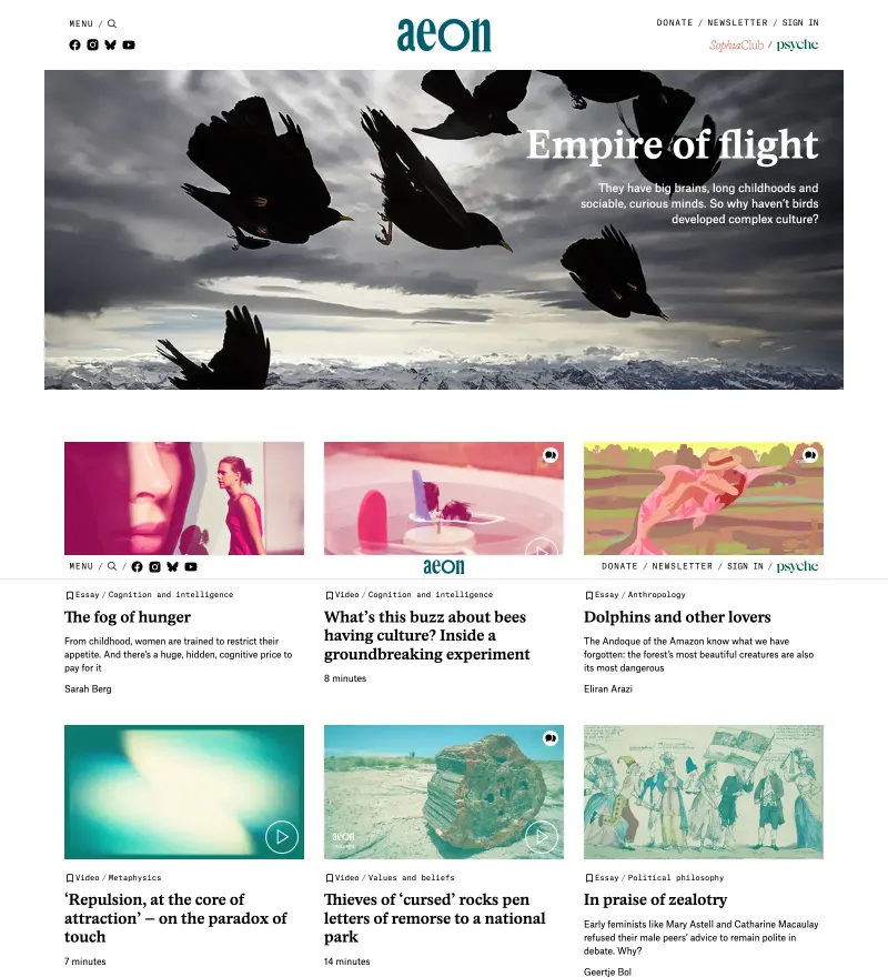
Long-form essays on philosophy and science, typeset like a print journal.
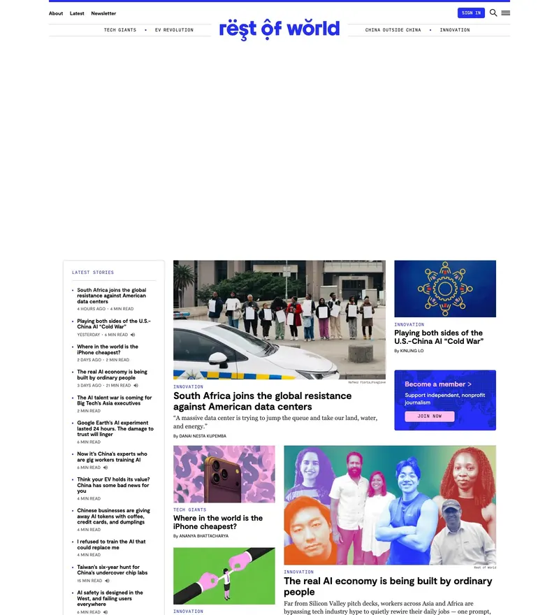
Technology journalism from outside the West, in a strong editorial system.
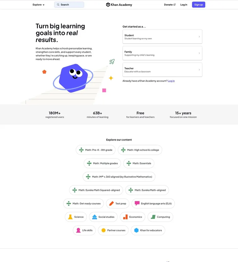
Free education at global scale, with an unusually calm information design.
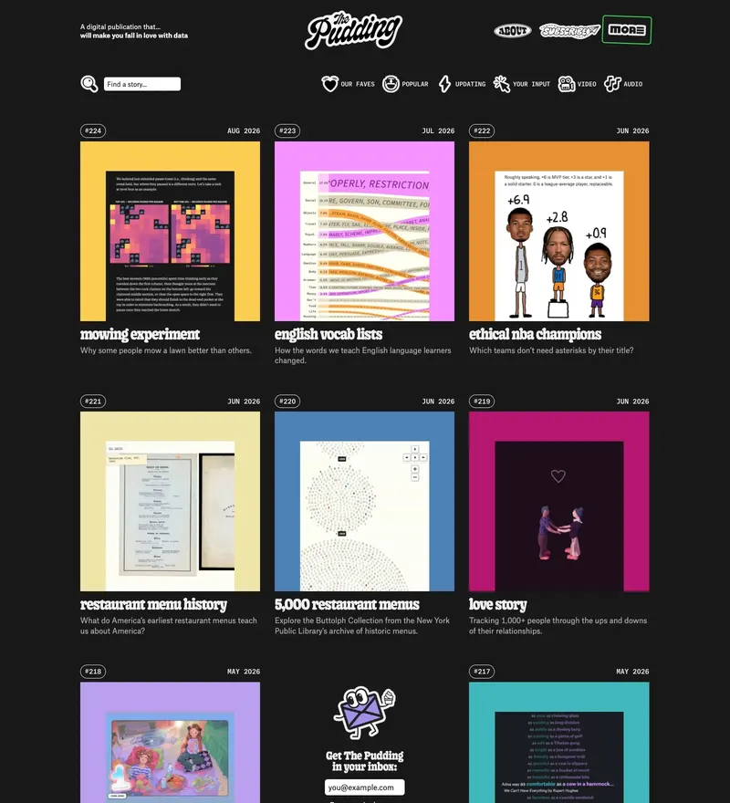
Visual essays where the scroll is the argument.
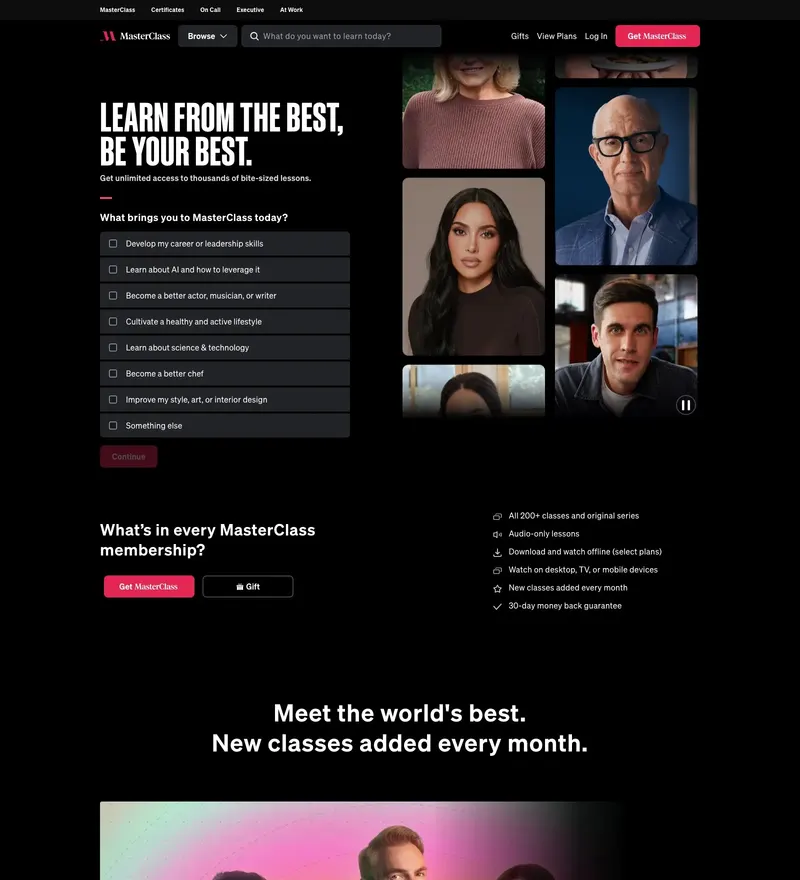
Celebrity-taught courses sold like a streaming service.

Interactive STEM courses where the marketing page is itself a lesson.
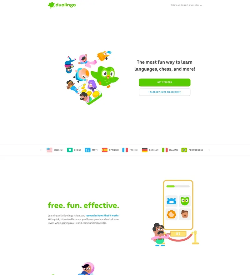
Language learning with a mascot-driven system that works on every surface.
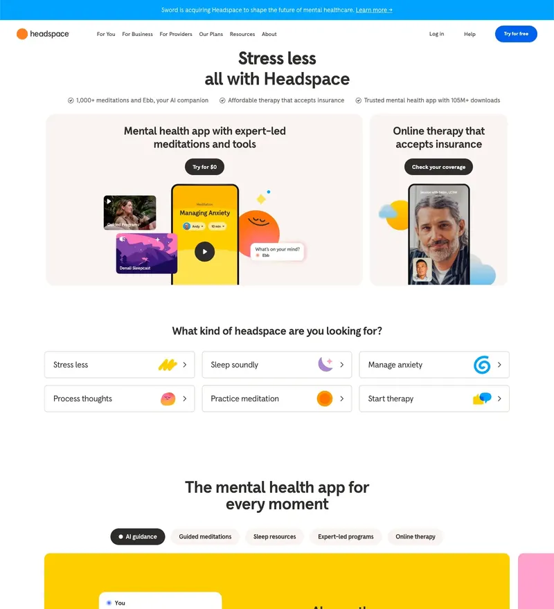
Meditation app whose illustration system is a brand asset in itself.
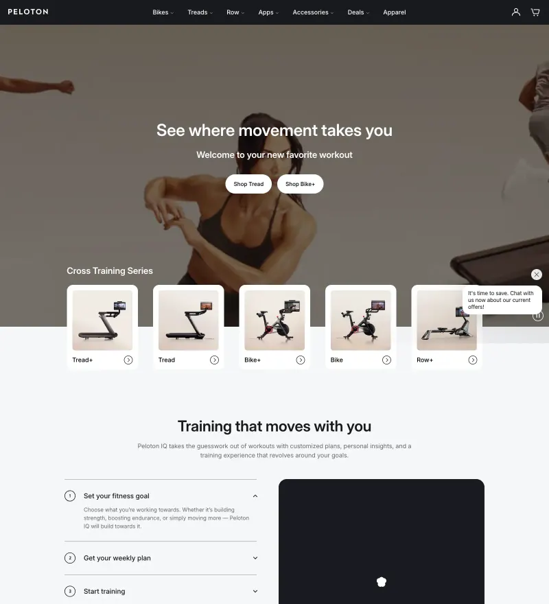
Connected fitness with the energy of a live class in the hero.
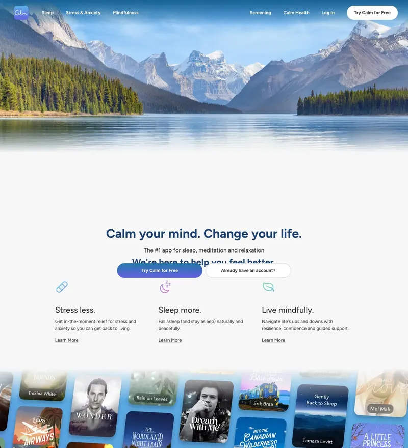
Sleep and meditation app that opens with a full-screen lake.
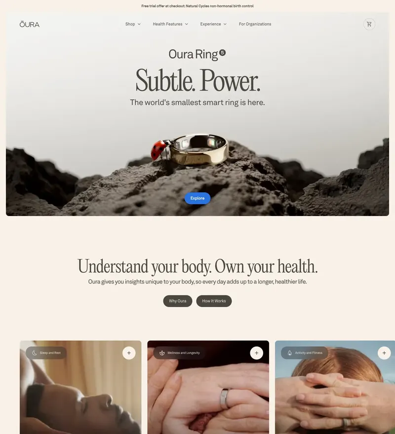
Sleep tracking ring with a quiet, jewellery-grade product site.
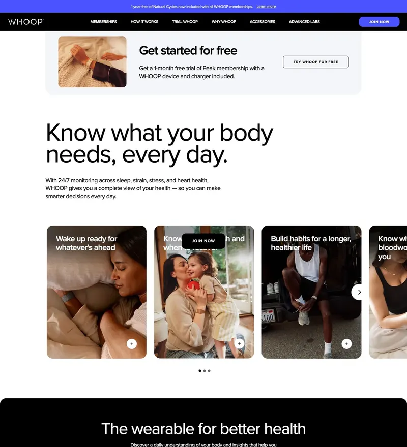
Fitness wearable with a dark, data-forward performance aesthetic.
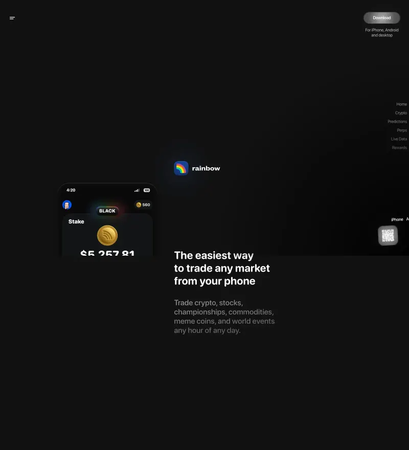
Ethereum wallet with an unmistakably joyful gradient identity.
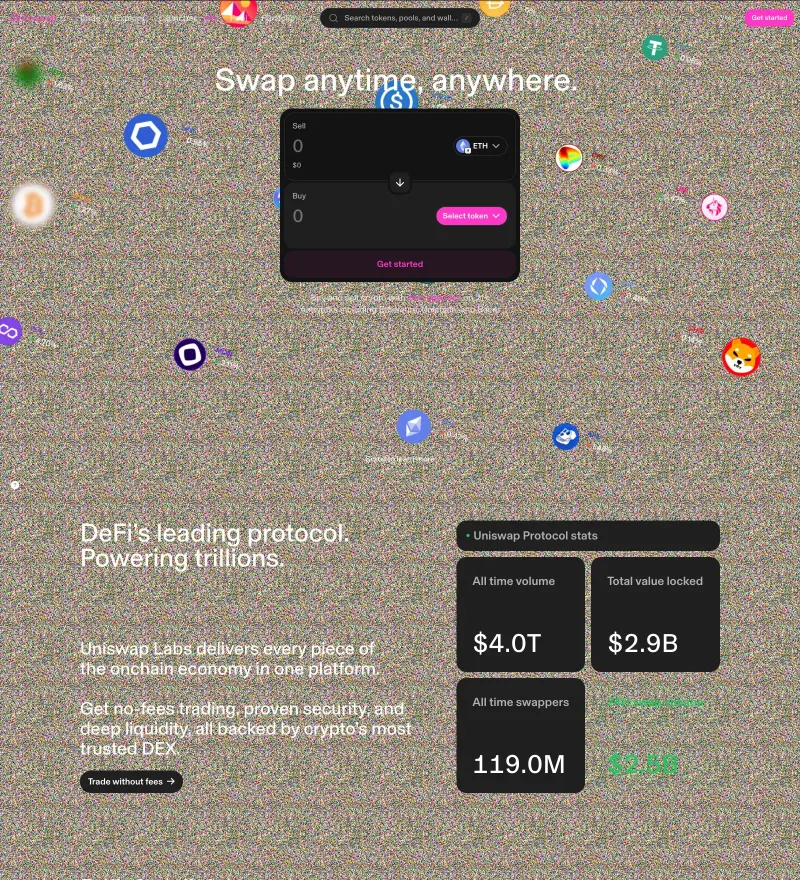
Decentralised exchange protocol with a soft-pink, distinctly un-crypto identity.
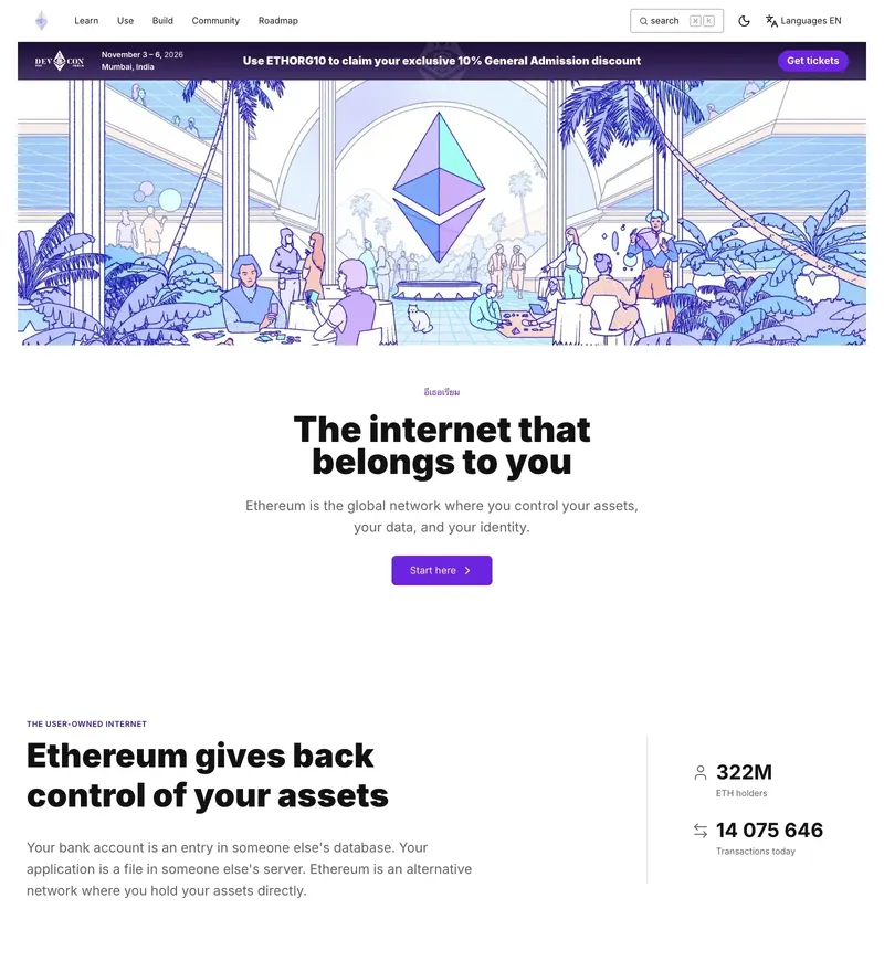
Protocol homepage that has to explain a blockchain to everyone at once.
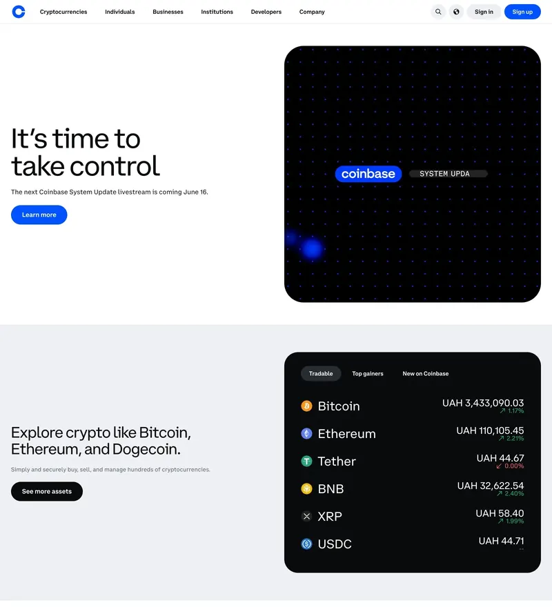
Crypto exchange with a deliberately institutional, trust-first presentation.
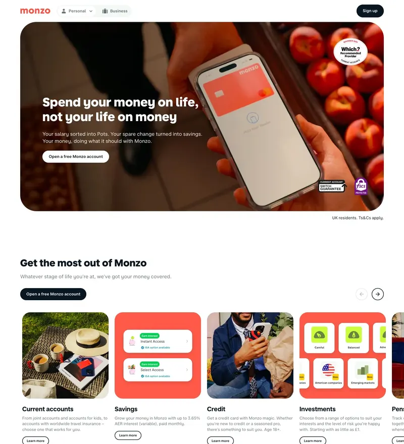
UK challenger bank with hot coral and a friendly, product-led site.
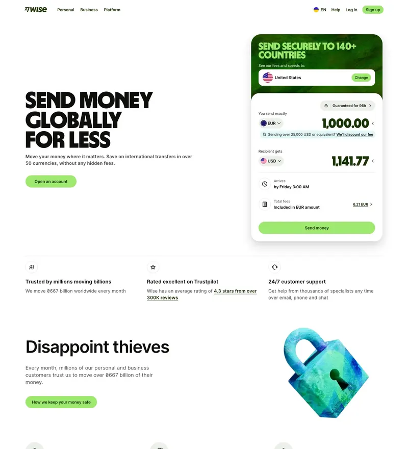
International money transfer with a bright, confident brand system.
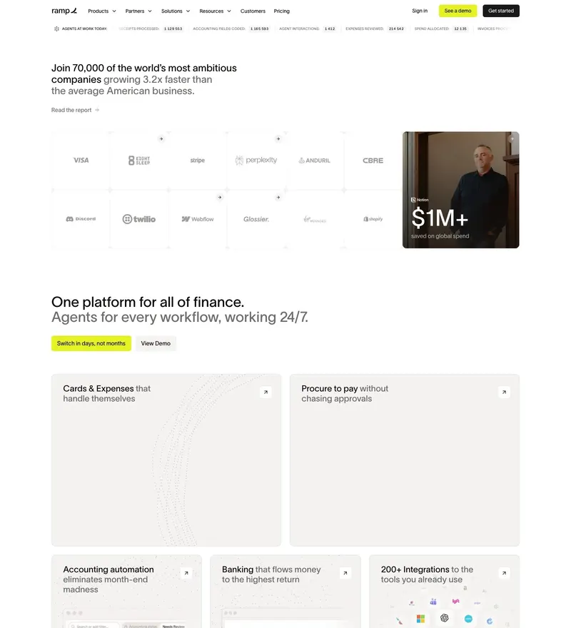
Corporate cards and spend management, presented with unusual restraint.
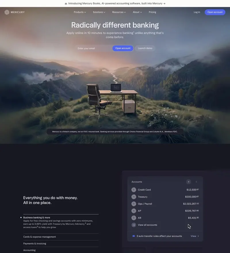
Banking for startups, with a soft gradient palette that avoids fintech blue.
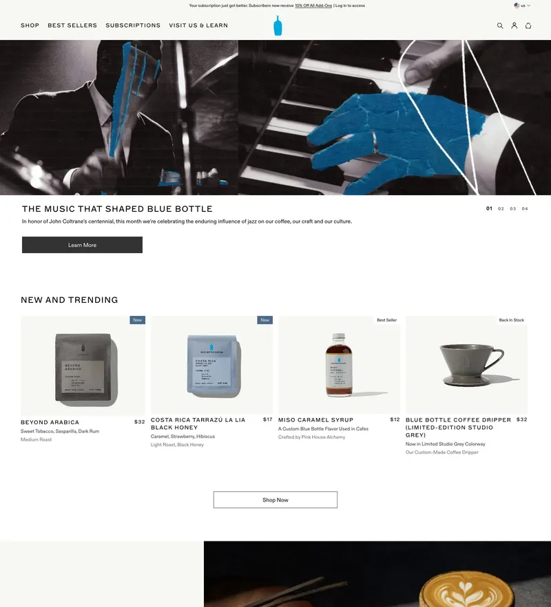
Specialty coffee with the calmest e-commerce grid on the internet.
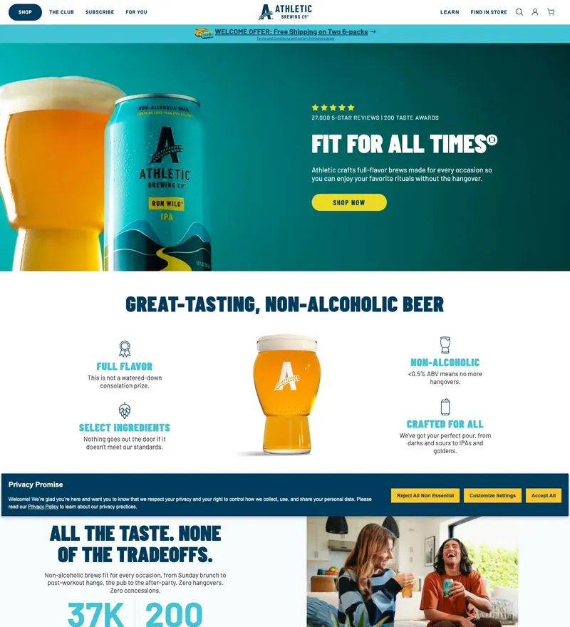
Non-alcoholic craft beer with an outdoor, photography-led store.
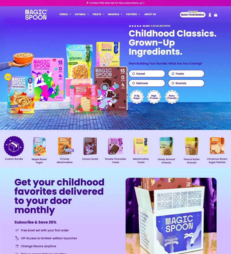
High-protein cereal wrapped in Saturday-morning nostalgia.
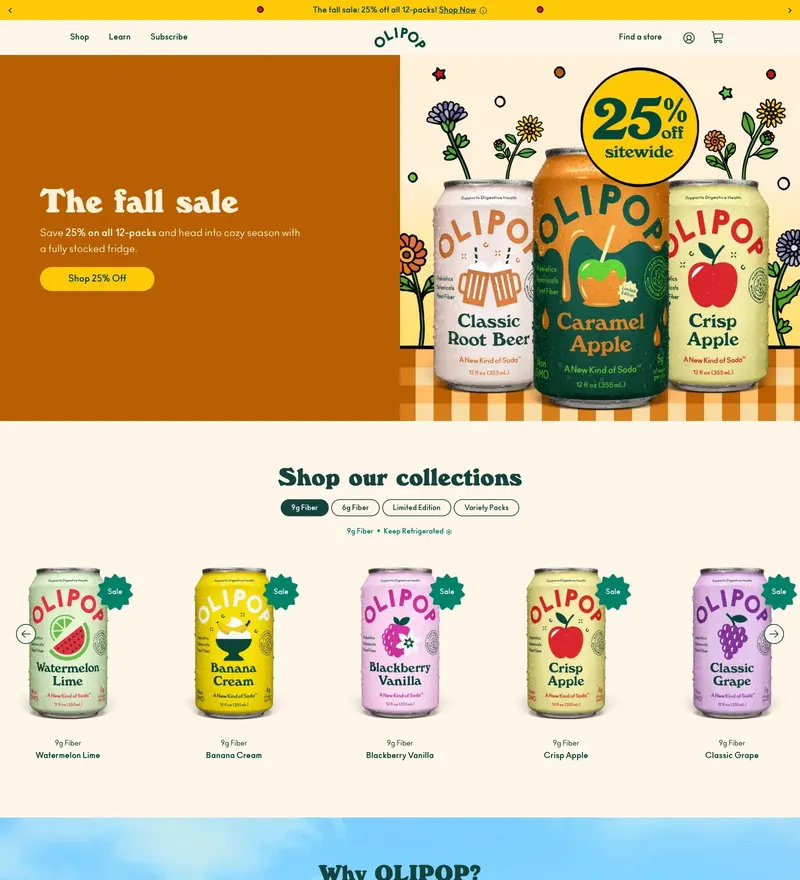
Functional soda with a pastel, mid-century-flavoured shop.
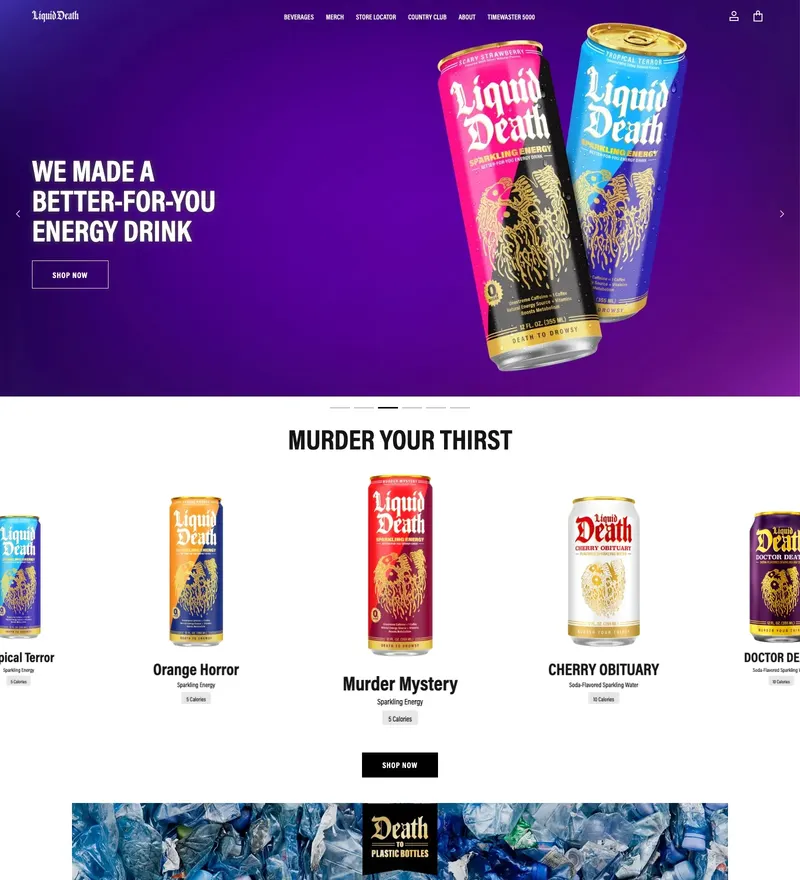
Canned water sold like a heavy metal record label.
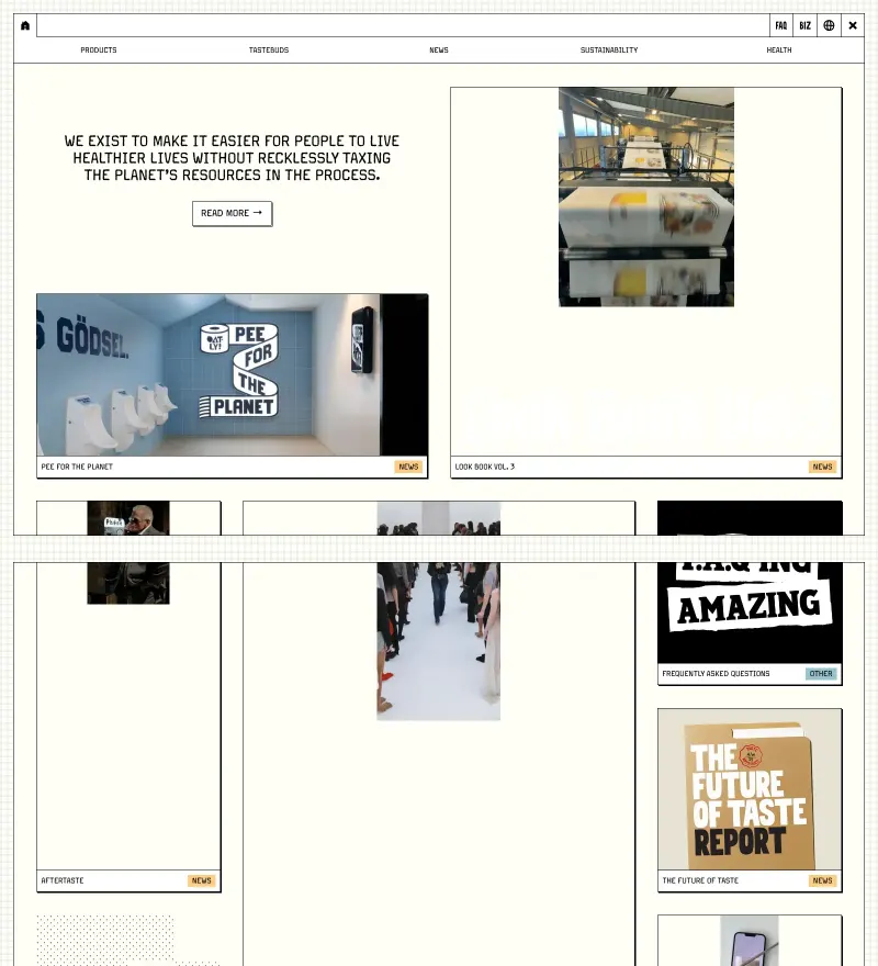
Oat milk brand that writes ad copy on its own packaging and website.
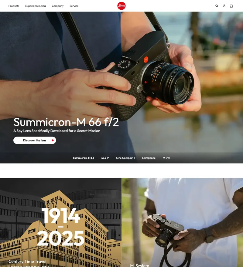
Camera manufacturer whose site is built around the photographs, not the specs.
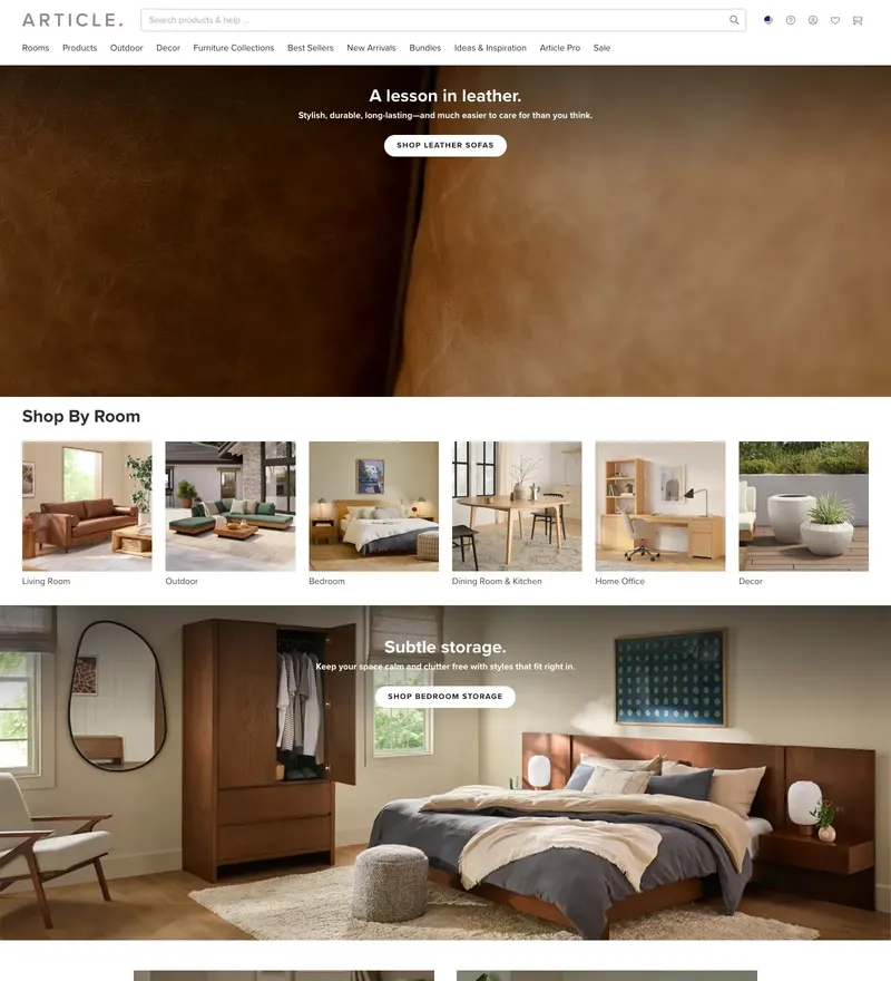
Direct-to-consumer furniture with room photography doing the selling.
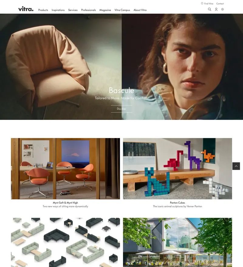
Swiss furniture manufacturer with a museum-grade digital catalogue.
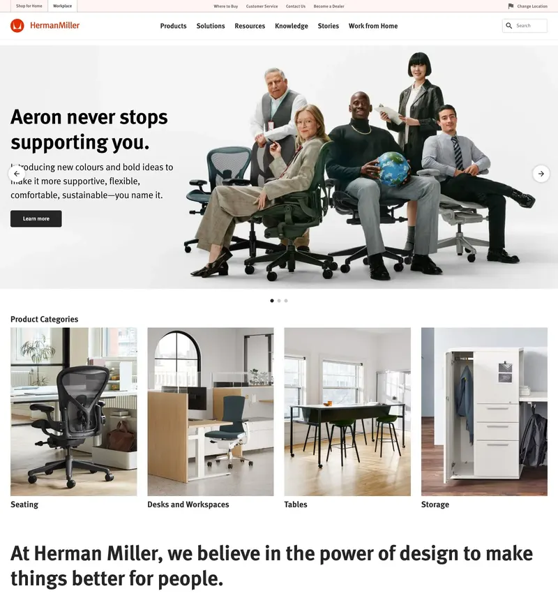
Furniture archive and shop with a mid-century sense of proportion.
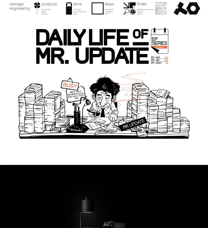
Synth maker whose site is as precisely playful as its hardware.
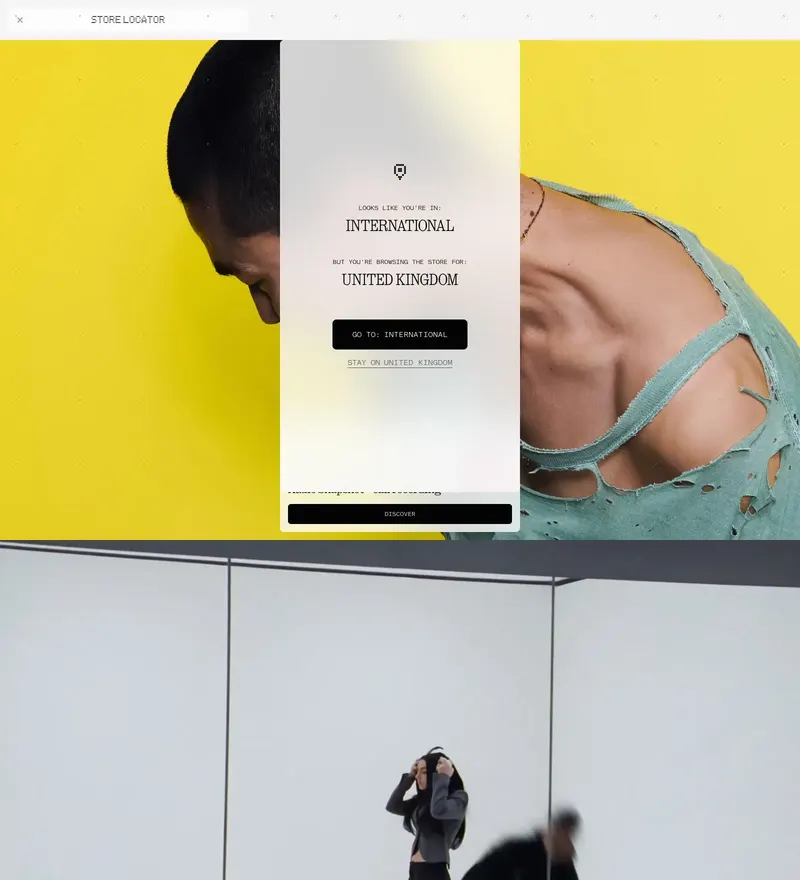
Consumer electronics with a transparent, dot-matrix design language.
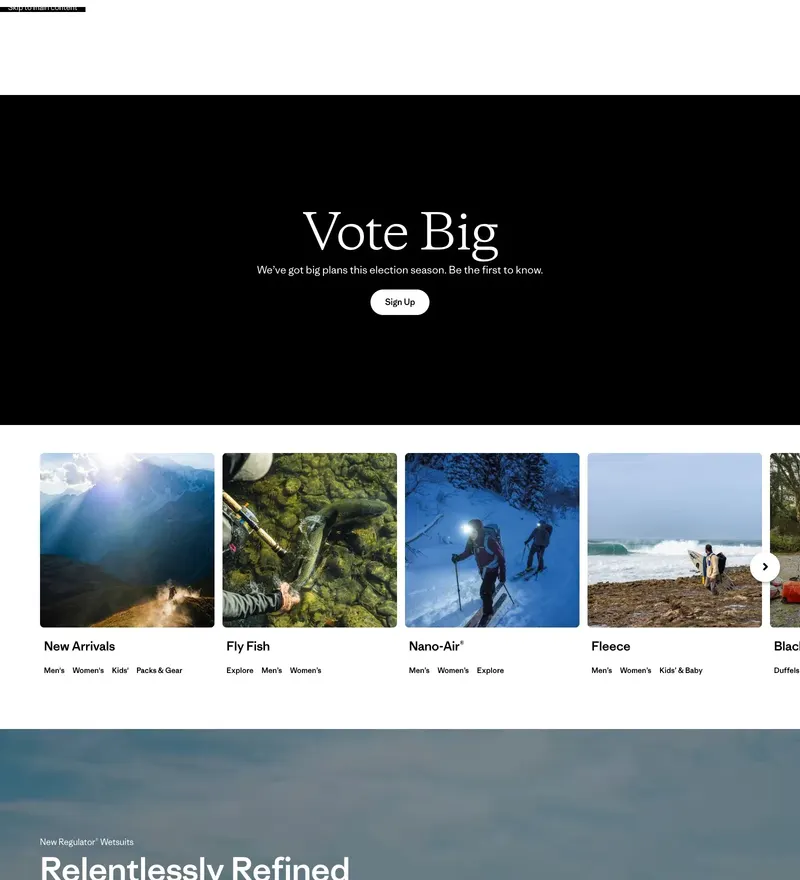
Outdoor brand that puts activism above the product grid.
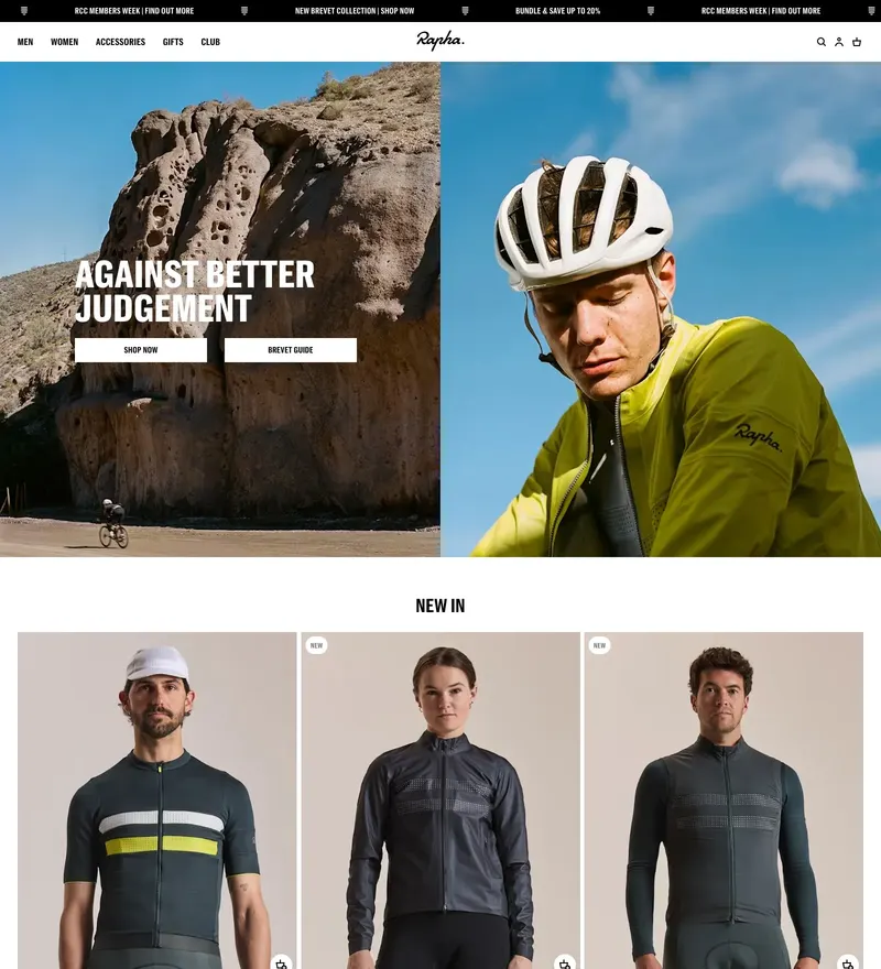
Cycling apparel with editorial photography treated like a magazine.
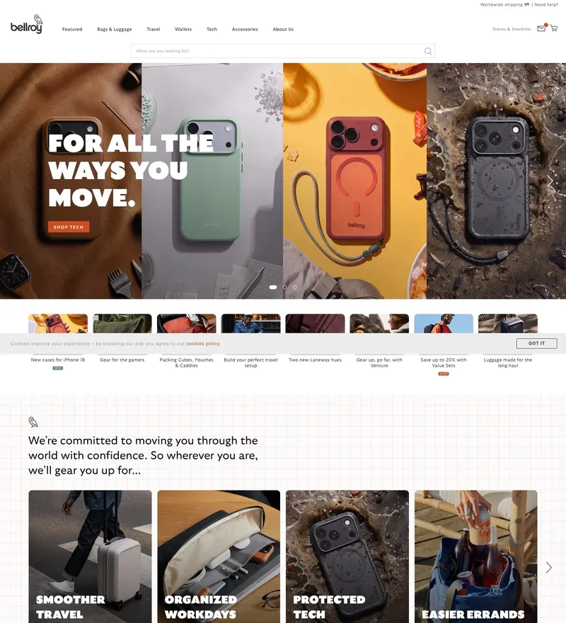
Carry goods with product demos that animate as you scroll.
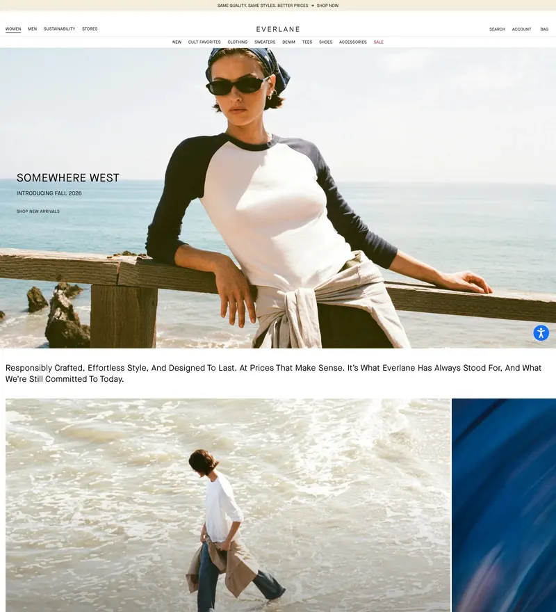
Radical transparency in apparel, presented in an unfussy product grid.
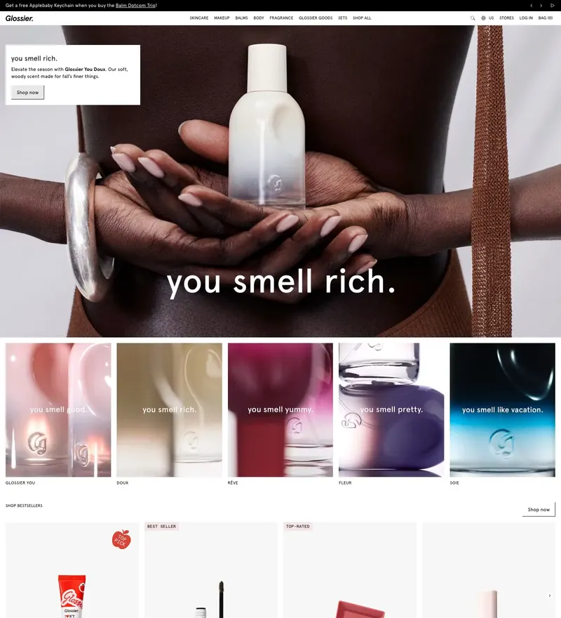
Direct-to-consumer beauty with the pink that defined a decade of branding.
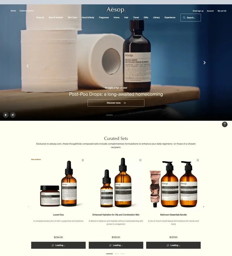
Skincare brand whose restraint in typography matches its packaging.
duolingo.com
Language learning with a mascot-driven system that works on every surface.
Sections
Typography
Colors
Report this site — wrong link, wrong tags, or you own it and want it removed.
