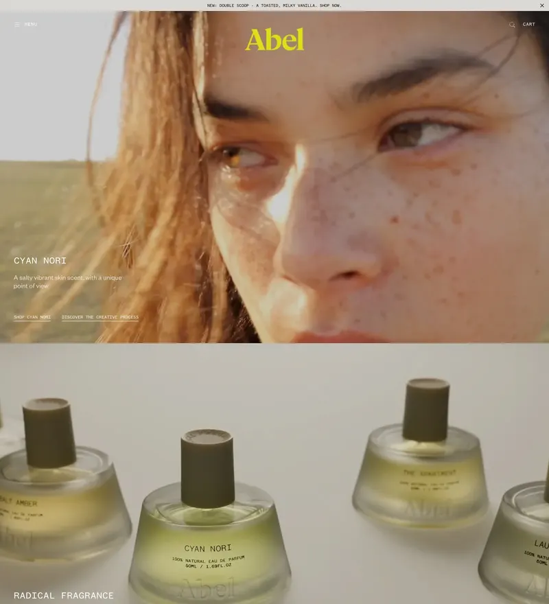
Abel Fragrance
Natural perfume in low-impact packaging, shot as portraiture instead of bottles on white.
47 hand-picked sites
Shop sites worth studying. Refine with the filters or search below.
Natural perfume in low-impact packaging, shot as portraiture instead of bottles on white.
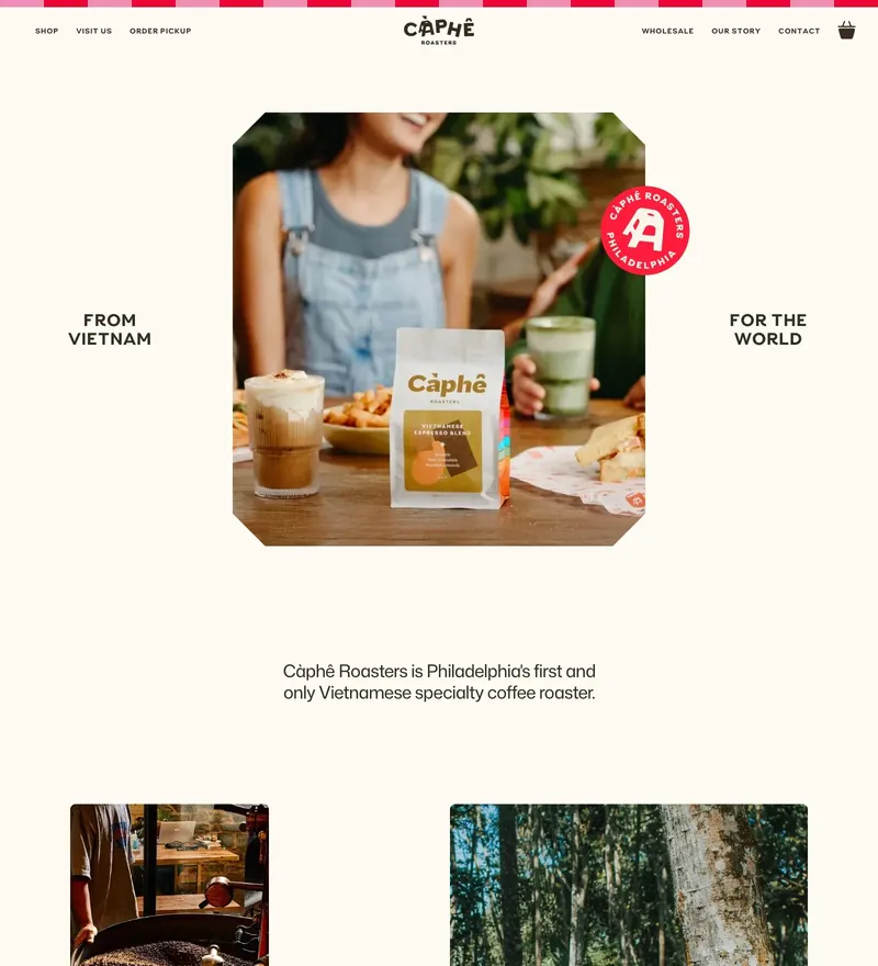
Philadelphia's Vietnamese specialty roaster, sold on the drink rather than on the beans.
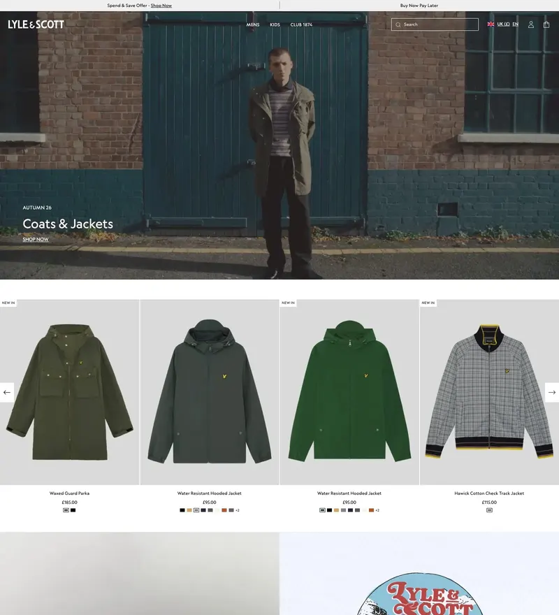
British menswear shot on location in low light — a shop that behaves like a lookbook.
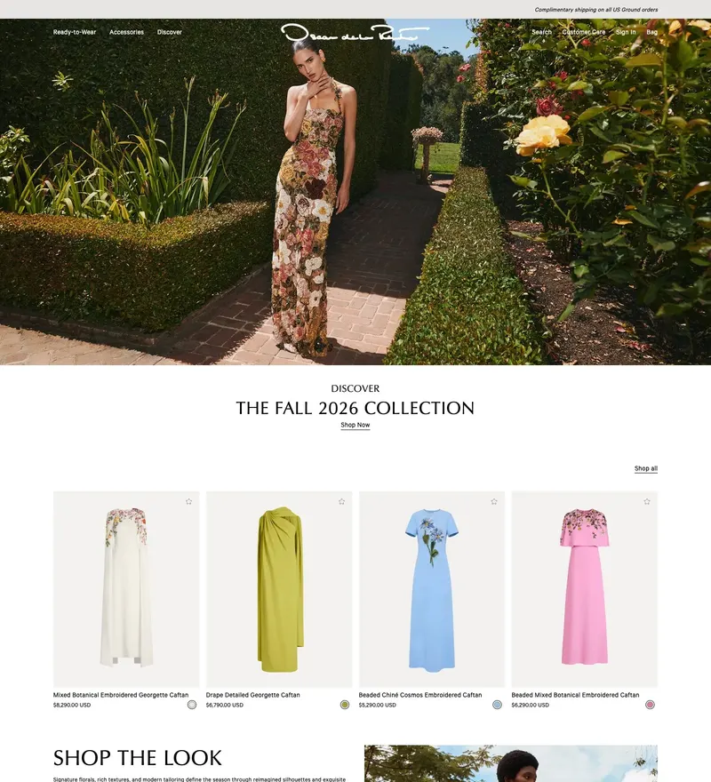
Ready-to-wear house whose storefront is shot like a garden at dusk, product almost incidental.

Personal care built around one bioactive ingredient — packaging photography and very little else.
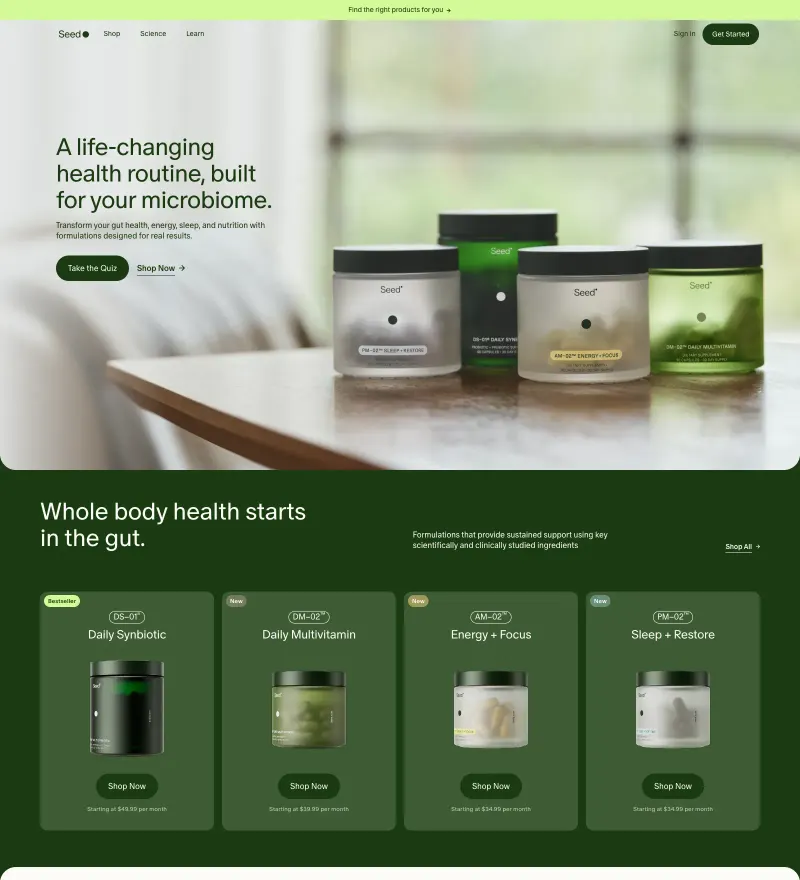
Probiotics brand that argues from science — long-form page held together by illustration and type.

Refillable wall calendars sold on restraint: white space, one product per screen, no urgency banners.
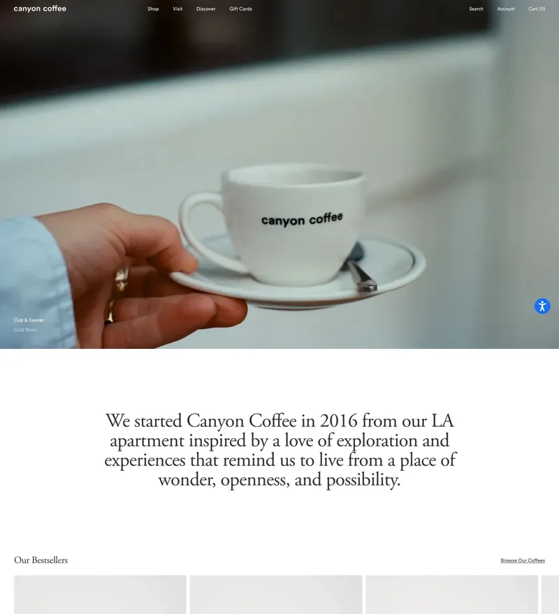
Los Angeles roaster whose site reads like a magazine spread that happens to sell beans.
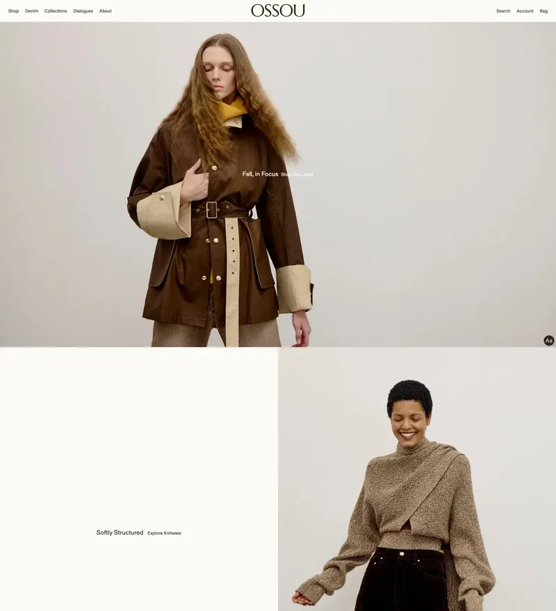
Denim brand named after the Latin for bone — photography carries the whole page, copy stays out of it.
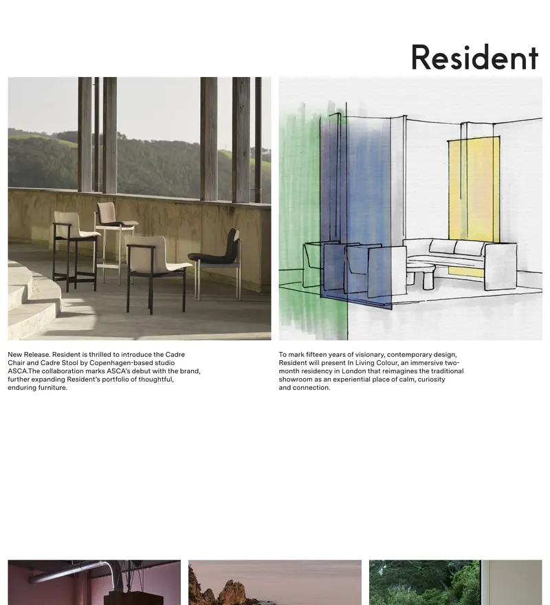
New Zealand furniture and lighting company with a catalogue that behaves like a gallery.
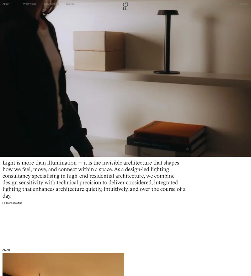
Design-led lighting sold on atmosphere rather than specifications.
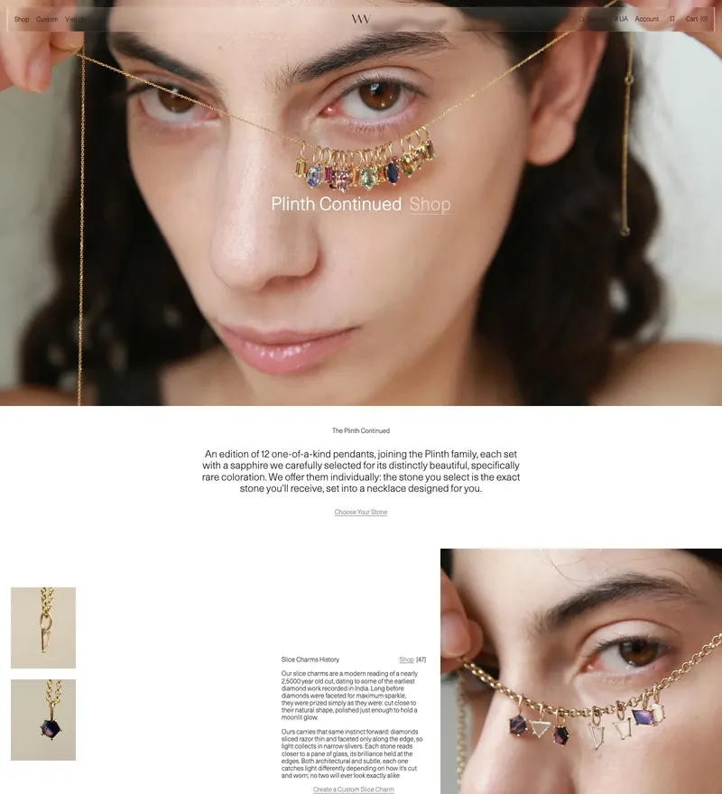
Handmade fine jewelry from a women-run NYC studio, sold on quiet product photography.
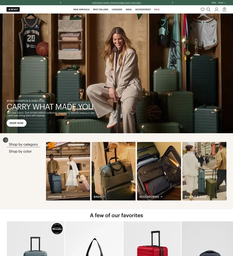
Luggage brand that sells travel first and suitcases second.
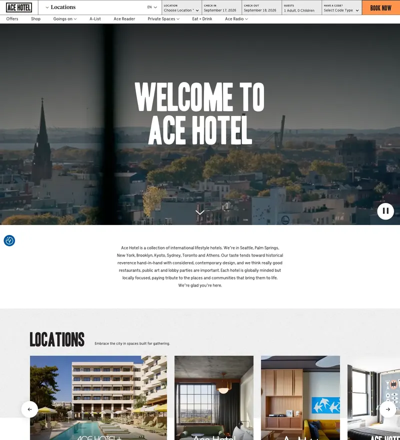
Hotel group with an editorial voice and a properly opinionated layout.

Electric adventure vehicles sold through landscape photography.
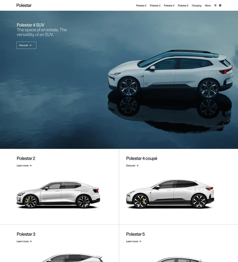
Electric performance brand with Scandinavian minimalism taken to the limit.
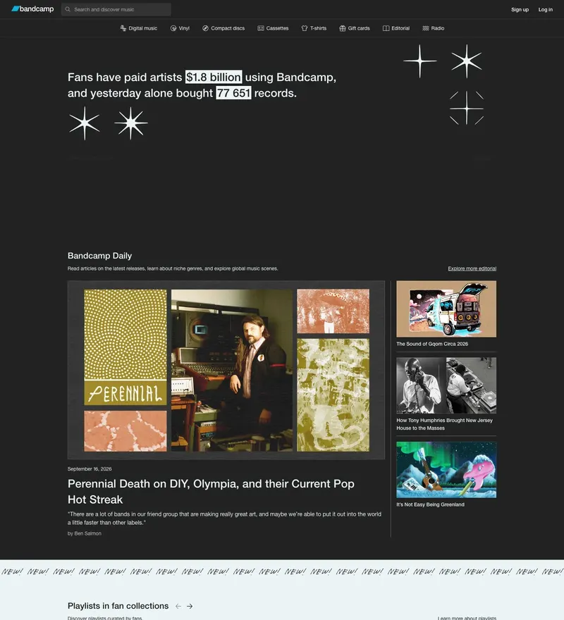
Artist-first music marketplace that has kept its dense, functional layout for years.
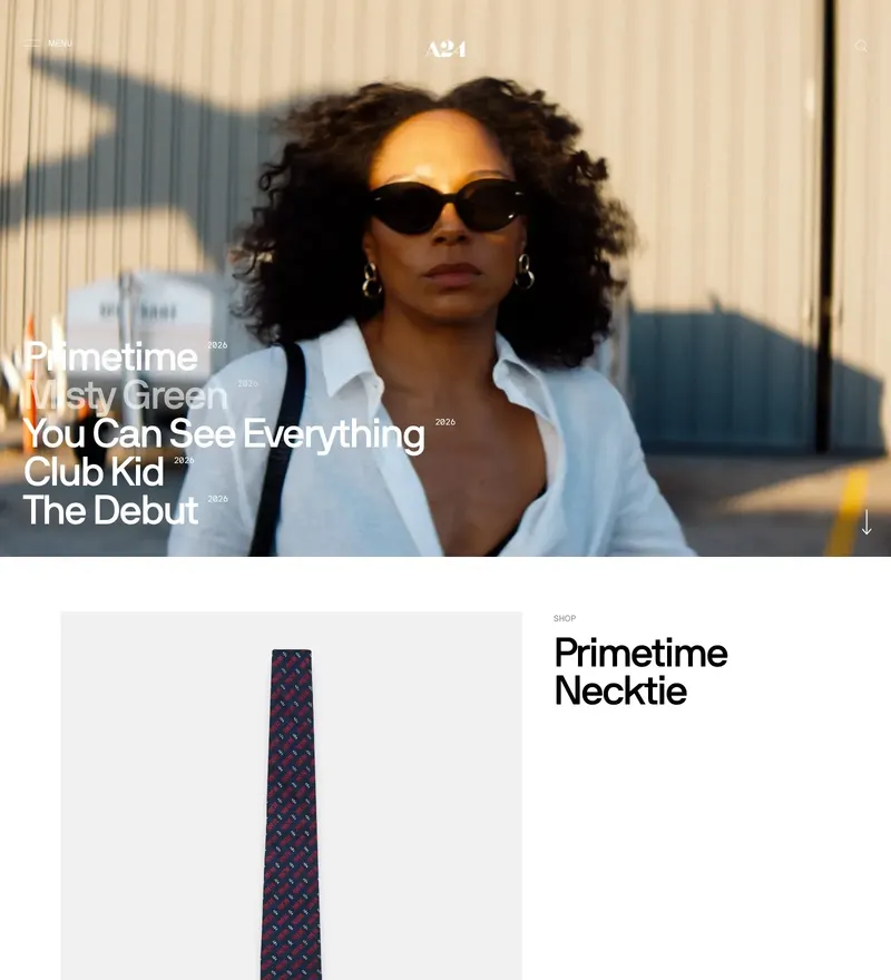
Film studio with a store and a site that feel like part of the catalogue.
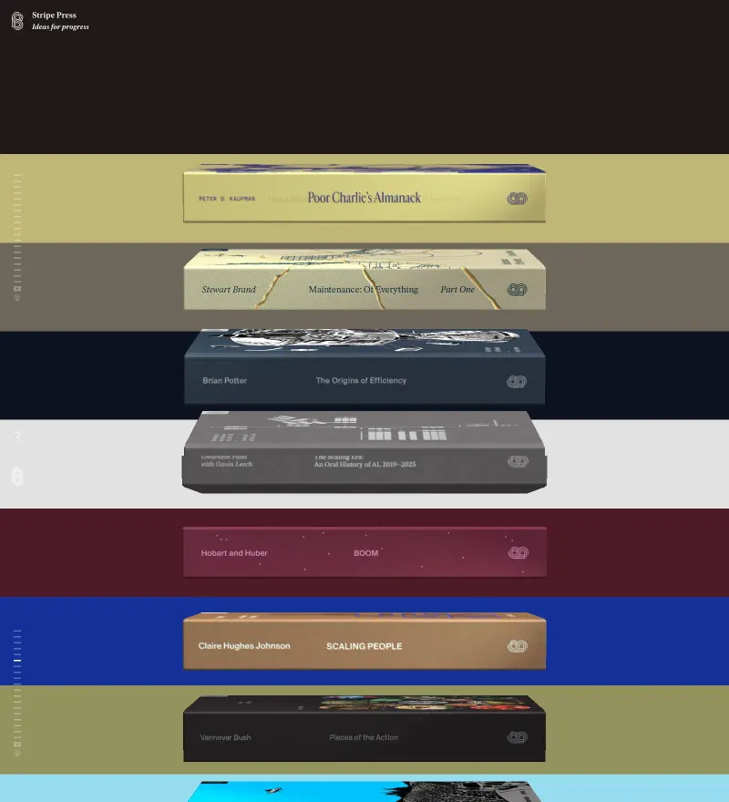
Books about technological progress, with covers rendered in 3D on the shelf.
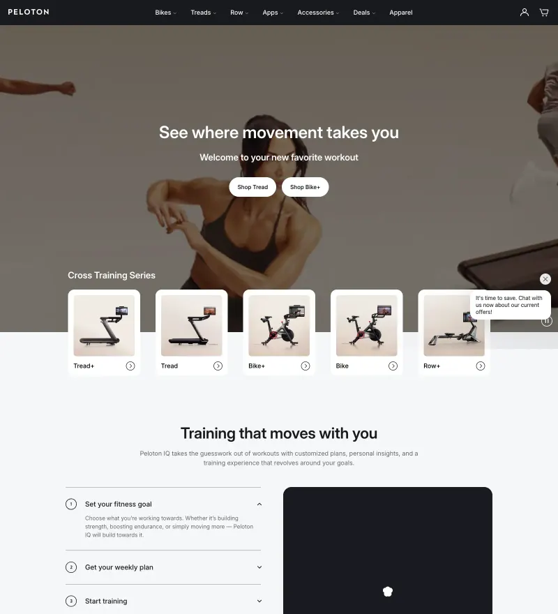
Connected fitness with the energy of a live class in the hero.
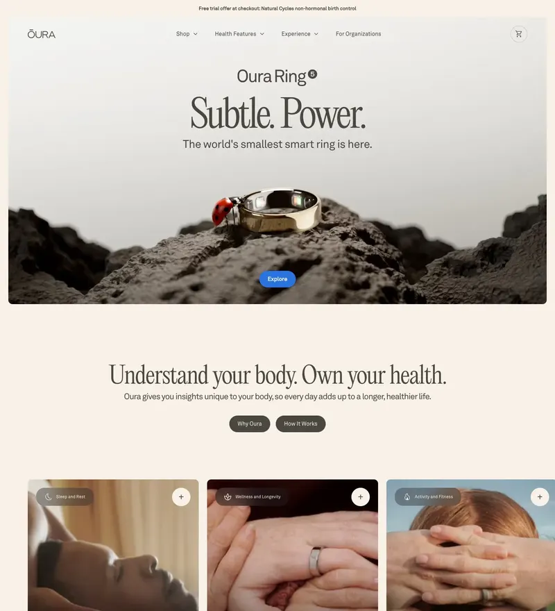
Sleep tracking ring with a quiet, jewellery-grade product site.
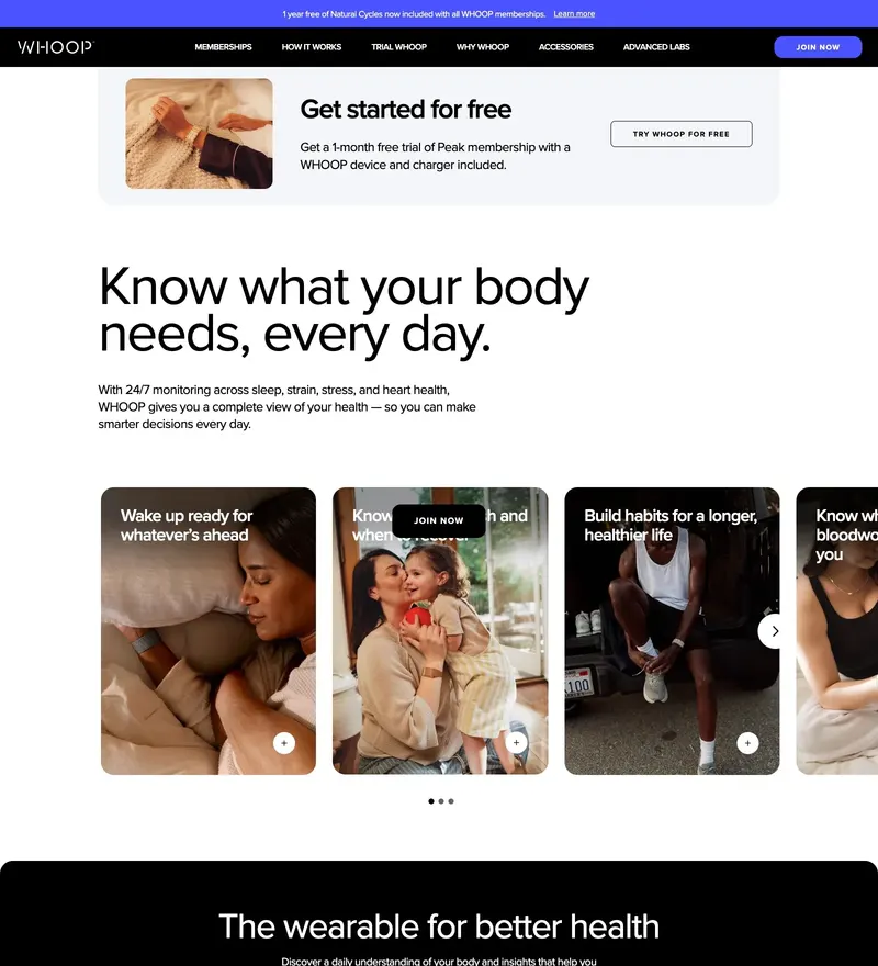
Fitness wearable with a dark, data-forward performance aesthetic.
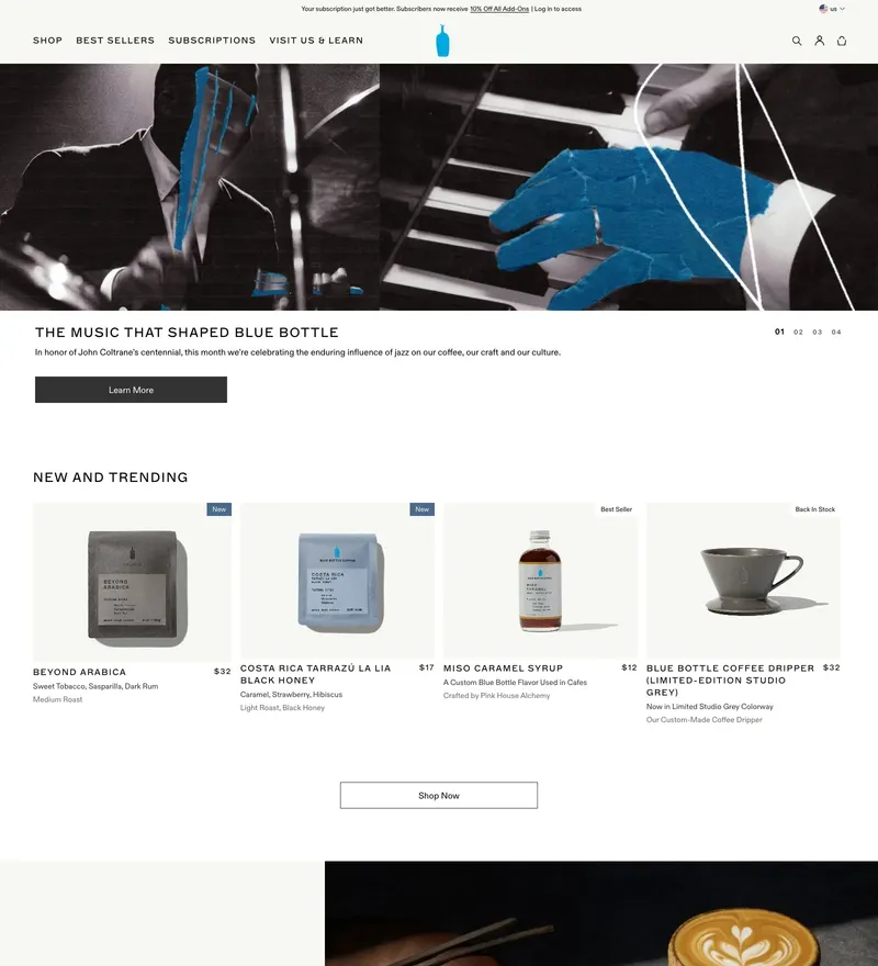
Specialty coffee with the calmest e-commerce grid on the internet.
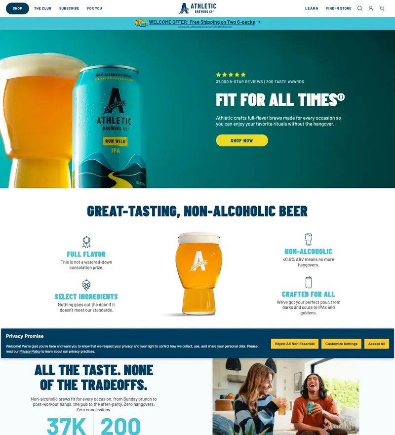
Non-alcoholic craft beer with an outdoor, photography-led store.
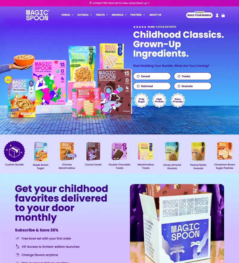
High-protein cereal wrapped in Saturday-morning nostalgia.
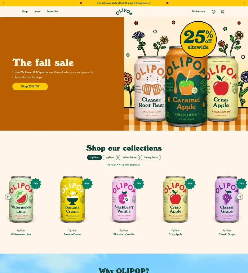
Functional soda with a pastel, mid-century-flavoured shop.
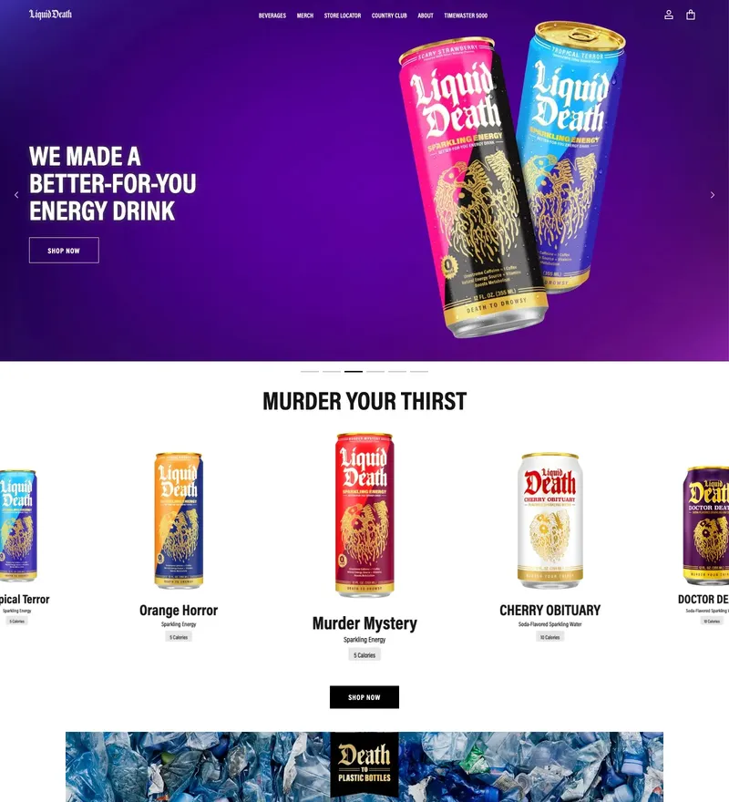
Canned water sold like a heavy metal record label.
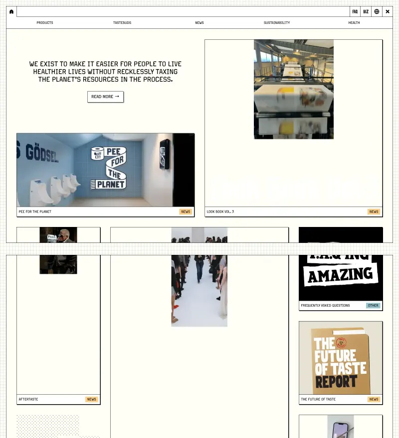
Oat milk brand that writes ad copy on its own packaging and website.
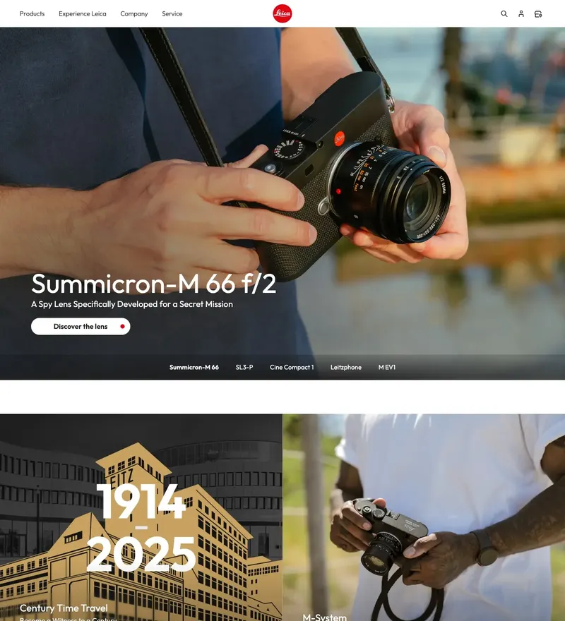
Camera manufacturer whose site is built around the photographs, not the specs.
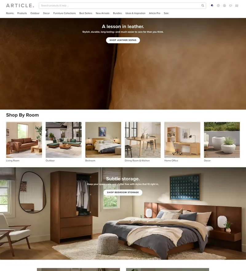
Direct-to-consumer furniture with room photography doing the selling.
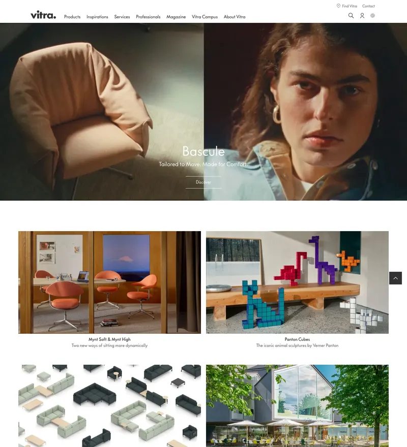
Swiss furniture manufacturer with a museum-grade digital catalogue.
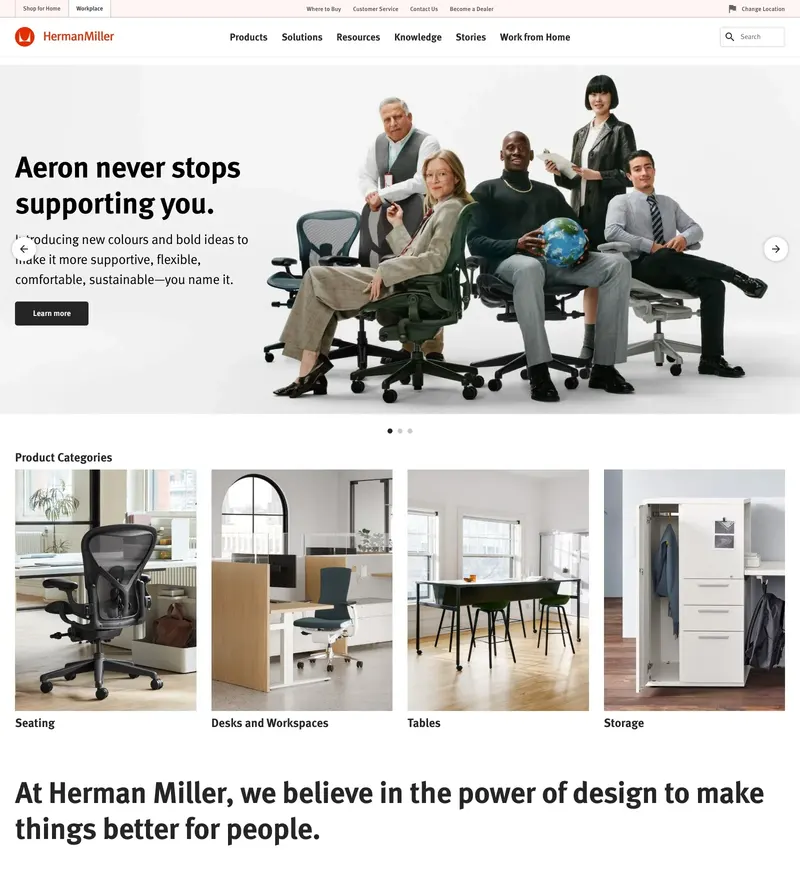
Furniture archive and shop with a mid-century sense of proportion.
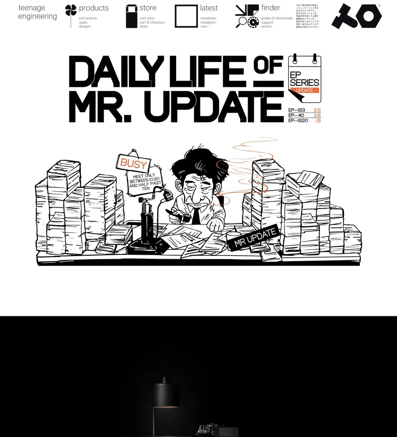
Synth maker whose site is as precisely playful as its hardware.
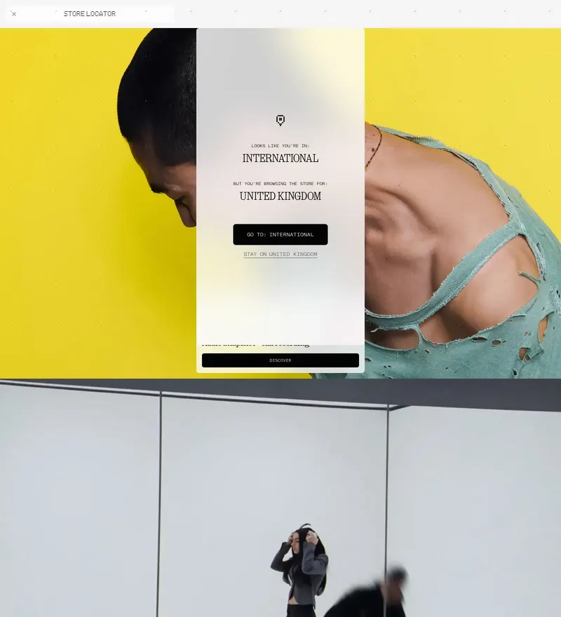
Consumer electronics with a transparent, dot-matrix design language.
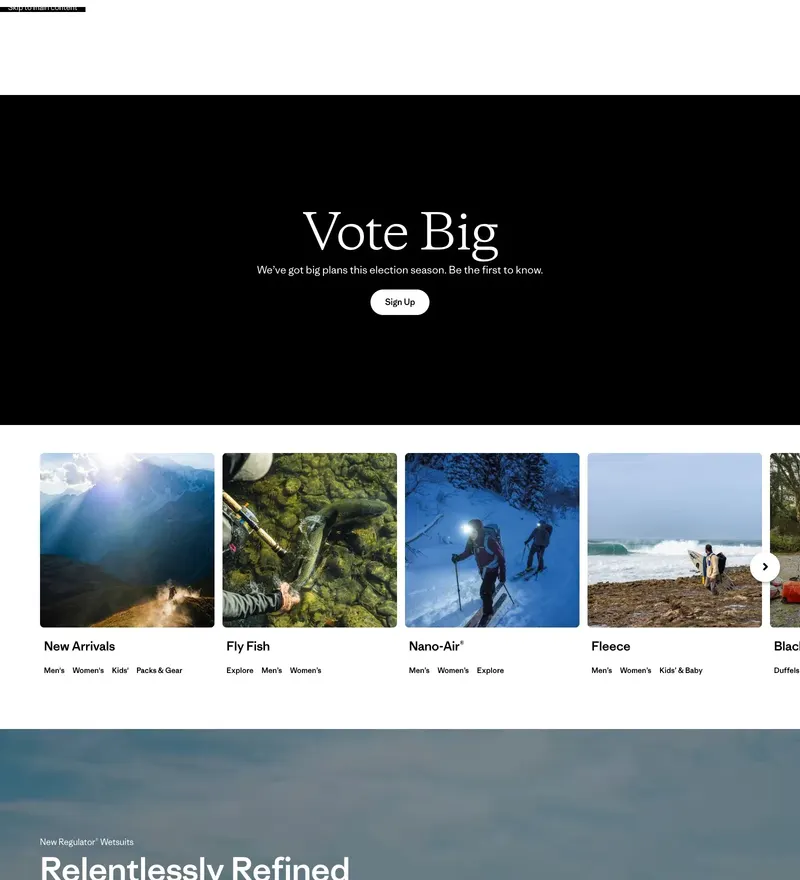
Outdoor brand that puts activism above the product grid.
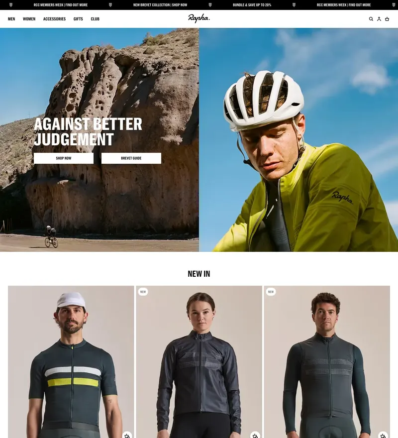
Cycling apparel with editorial photography treated like a magazine.
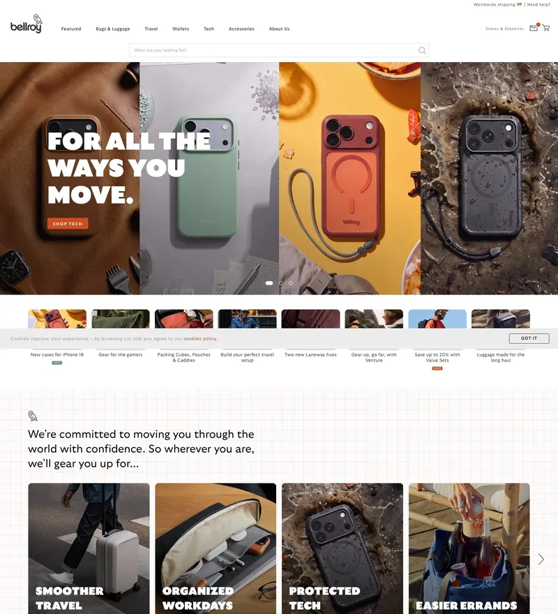
Carry goods with product demos that animate as you scroll.
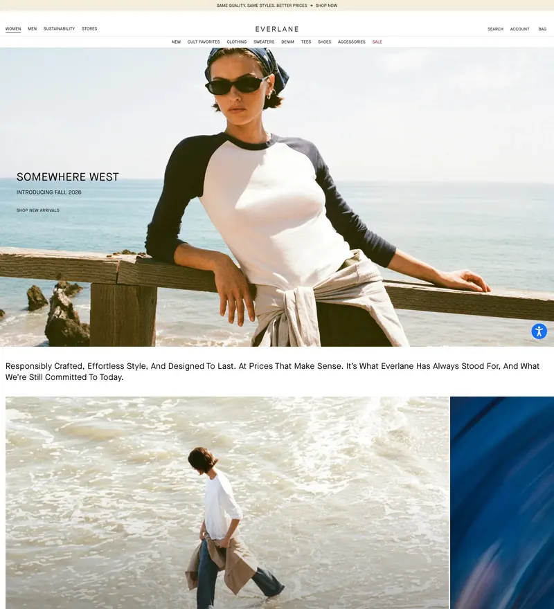
Radical transparency in apparel, presented in an unfussy product grid.
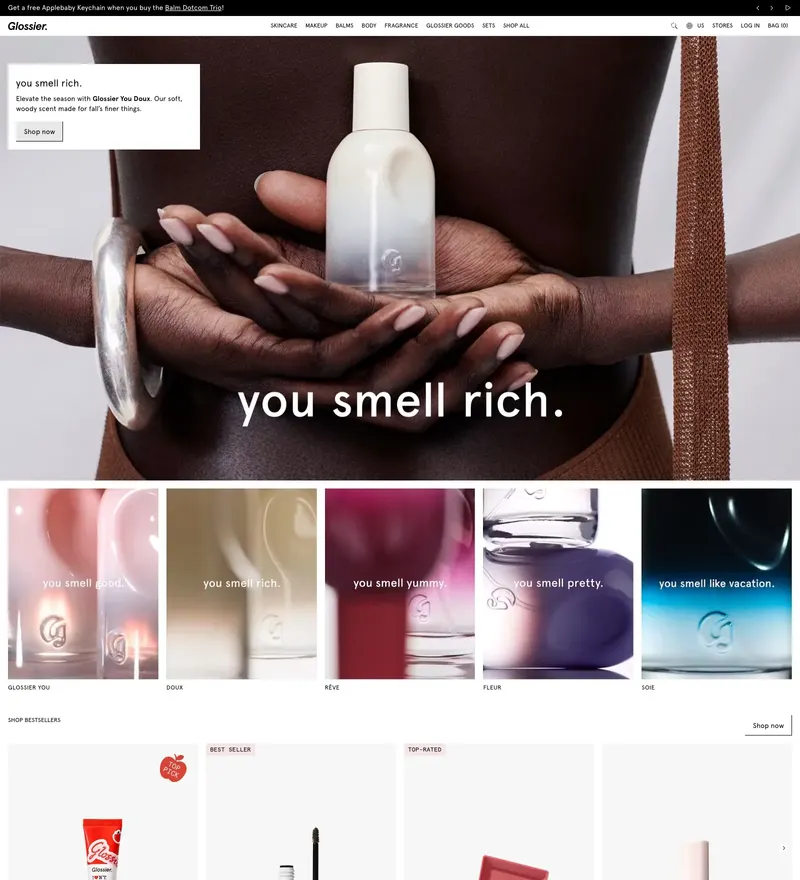
Direct-to-consumer beauty with the pink that defined a decade of branding.
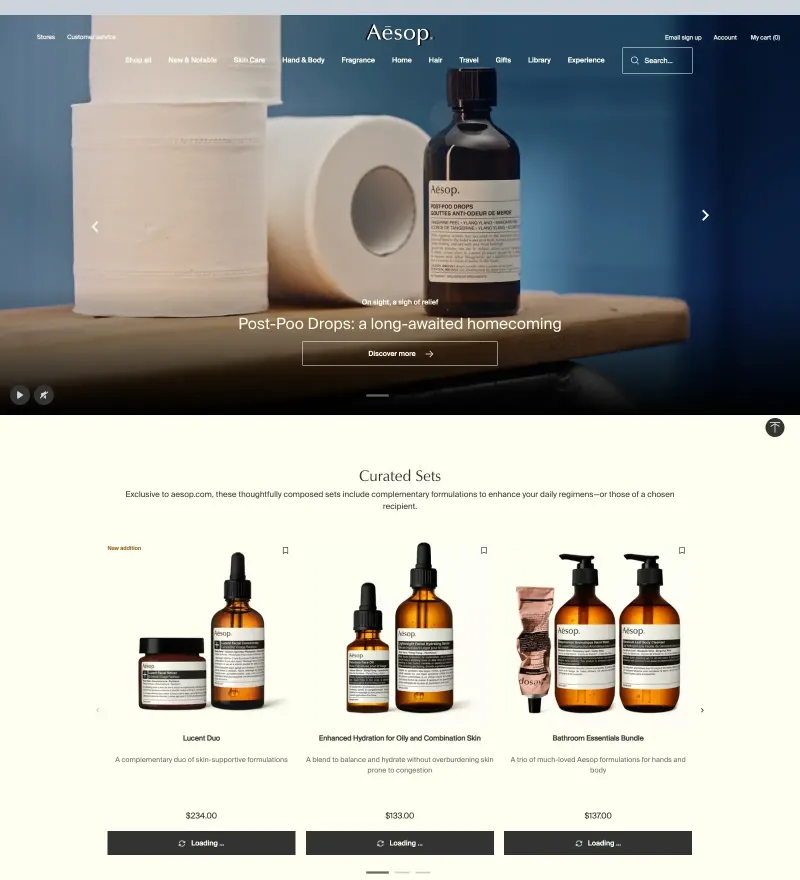
Skincare brand whose restraint in typography matches its packaging.
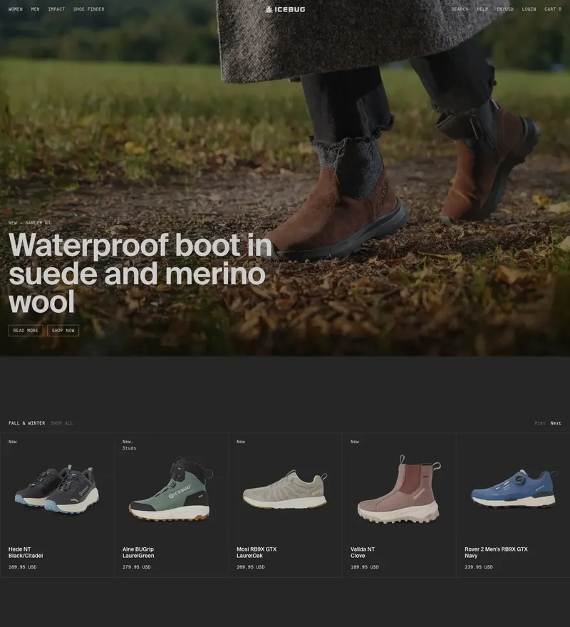
An ecommerce store for an outdoor footwear brand known for winter traction shoes.

An ecommerce brand for apple cider vinegar and wellness supplements.
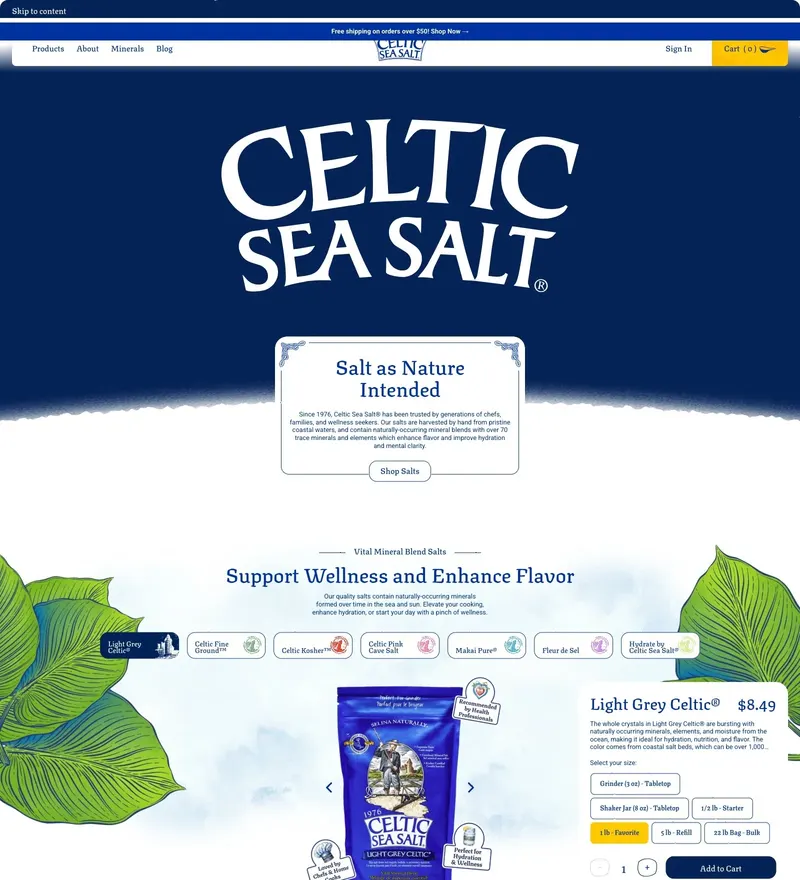
An ecommerce brand selling mineral-rich sea salt for cooking and wellness.
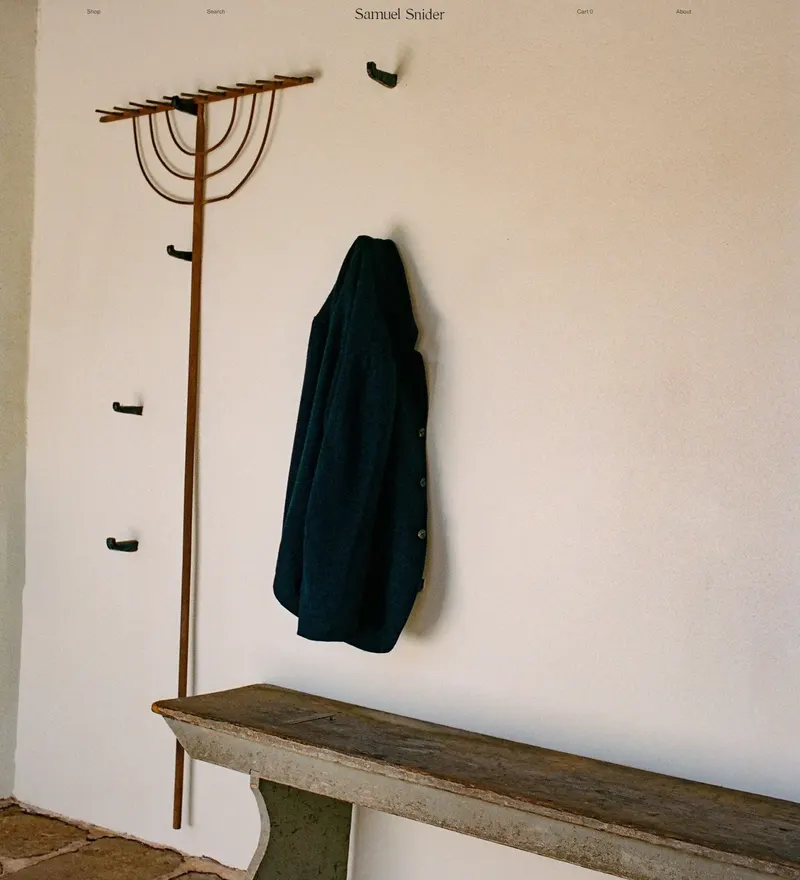
A Brooklyn studio making small-batch linen and natural-fiber garments, patterned, cut, and sewn in-house.
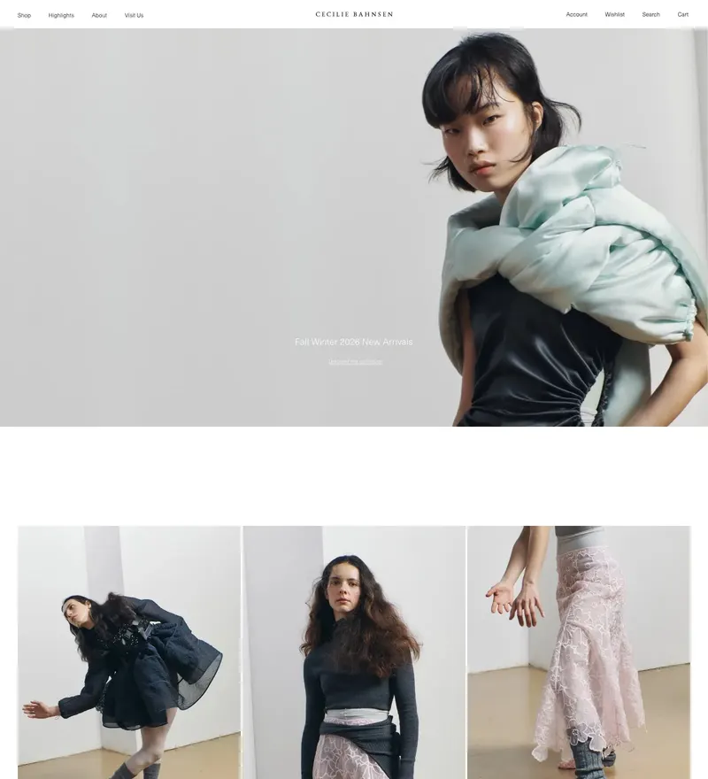
Ecommerce site for Cecilie Bahnsen, a Copenhagen-based fashion label known for romantic, voluminous silhouettes.
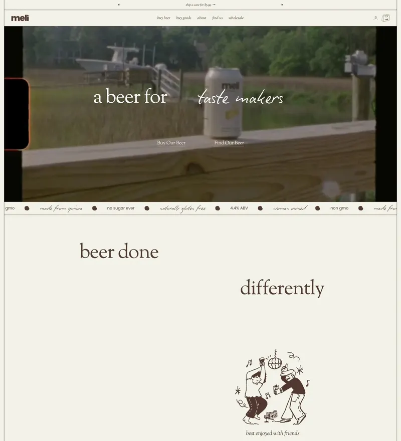
Shopify storefront for meli's ready-to-drink beverage line, built around bold product photography and a punchy brand identity.
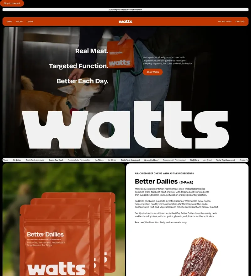
Ecommerce brand for real-meat, function-targeted pet food, built with bold typography and warm, earthy tones on Shopify.